Apple Health- Bad UX or Irresponsible UX?
What is a designer’s responsibility to resist marketing? Should a design communicate when the data is low confidence? An exploration into Apple Health.
Apple Health is full of snazzy, mysterious charts, and data points. But what did these numbers actually mean? I was bored one evening and decided to try and find out. Come join me on this trip down the rabbit hole!
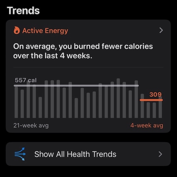
Like perhaps millions of people, I received a surprising alert on my iPhone. “On average, you burned fewer calories over the last four weeks”
I hadn’t realized anything was being tracked on my phone.
I didn’t ask it to track my calories. I don’t use an Apple Watch and no longer use exercise tracking apps.
I’m not an expert, but know a bit about exercise tracking as a (slow) runner who’s done 16 marathons. I’ve learned that health and fitness measurement is HARD to do. If you get deep into VO2max, glucose testing, etc you will not leave with a simple measurement for health. The human body is weird and complicated. We do not have a science of health, we are squarely in the “alchemy” era. Our gadgets might report numbers, but how accurate they are, and if they are meaningful is a deep question. If you are making bold marketing claims, you might be enabling the many weight loss and health-hacking grifters.
You probably have heard of “10,000” steps, but did you know this number is just from a marketing campaign for a Japanese pedometer. 万 (ichiman) = 10,000. That’s it. There’s no science, just marketing.
What might Apple, with its near-monopoly, billions of dollars, and access to all my data, be able to say?
Let’s start with what triggered this alert. What data was behind it?
OK, so the alert is from something branded “Active Energy”, but what is that?
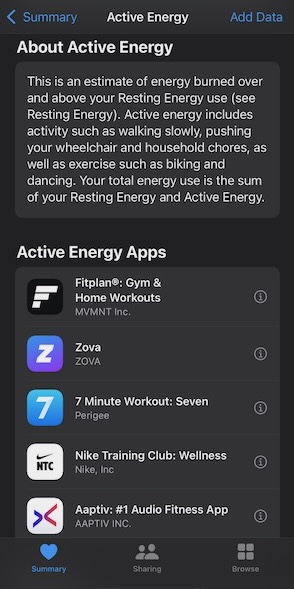
Let’s note that they invented a new term, and immediately pivoted to marketing other apps. Why these apps, in this order? Are those companies paying for placement? Who knows! (We’ll get to “Resting Energy” later.)
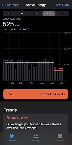
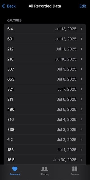
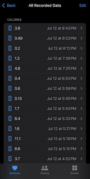
OK but where is it getting the data? How do we know it is accurate? Ahh, here is a list of calories per day. Seems low to be honest, I’m a pretty active guy, but lets explore.
Here we can see the calories per … obscure divisions of time. You can’t even compare the calories because the time periods are different. This screen is so odd and clearly not designed. It might be useful to add a chart, showing calories per time of day.
Finally, we got to the data point.
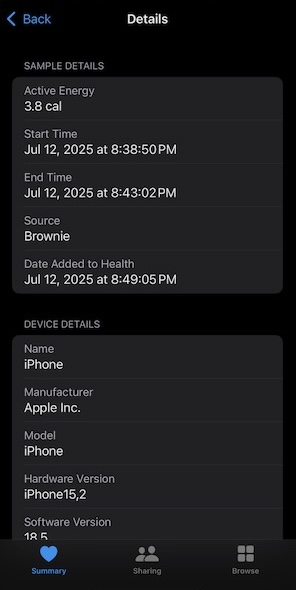
The only data source is the phone itself! Sadly the app doesn’t even explain where the data comes from. Some googling suggests the phone gets moved and calculates energy burned.
But who is supposed to use this screen? Maybe the internal QA person?
The reason the last 4 weeks were low is that I was working my butt off doing carpentry, so the phone was sitting on the bench all day.
What about “Resting Energy”?
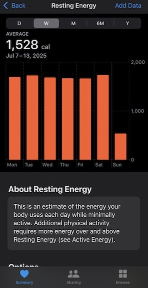
Here is an example output of resting energy
Wait, this is from when I’m sleeping! Where are these numbers from?
From my googling the “Resting Energy” calories number is simple calculation from the profile data (height, weight, age, gender), not physiological measurements. Apple has not publicly documented the exact formula they use. Online, some people claim it matches the Mifflin-St Jeor basal metabolic rate.
OK, so for active energy, it uses the accelerometer, does some fancy math, and generates a number. For Resting Energy, it just does really basic math to give you a statistical average number.
I’m all for simplicity, but it seems like Apple is hiding complexity, or perhaps hiding when the data is poor. Good designers use a “progressive disclosure” technique to support the user as they want to dig in.
A Designers Responsibility?
When you design a data visualization app, there is a responsibility to show the data accurately. In finance news, a common way to make a stock chart more “exciting” is to zoom in on the latest changes. If you show the chart with the Y axis starting at 0, the change is probably tiny. If you zoom in on all stocks, you lose the ability to see the stocks that are really changing.
There is also a responsibility to show your confidence on the data. Is it inferred, or measured? Use common terms that people can look up. We should design an interface that shows when we are confident of the data, or maybe admit “Not enough data to show a score”
How do we know this is not BS? Apple gives you a bold, confident announcement, that if you dig into, seems to be based on extremely weak data. If I was burning this few calories, I should be gaining a lot of weight! Am I? The app doesn’t ask.
This issue is that they are working backwards from clever uses of the phone hardware (accelerometer) with generate slick screens. But is the accelerometer a good and honest way to track calories? I can’t even imagine how. Some people put phones in their pockets, some in a purse, some leave it on a workbench all day.
They want to market a Health app, but without doing actual health work (which is hard and legally complicated.). So they kind of fake it. Show you some numbers. A colorful bar chart. But how is it designed to make sure the numbers are right? They could tell you that Resting Energy is based on the body metrics people put in, not always accurately.
They create new terms and don’t link to the common terms that an interested person could follow up with their doctor. Is Resting Energy the same thing as Basal Metabolic rate? Who knows! Maybe it is just BS marketing, but is also prevents accountability. You are dependent on Apple’s measurements, which are kind of a dead end. A person who is taking their health seriously has no links to explore and learn further.
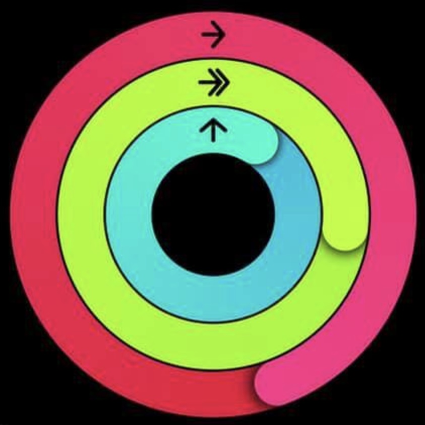
Apple suggests that if you fill the rings you are doing well, but that is not obviously true.
It seems concerning that the screens Apple’s designers did are the most banal list / data views. There isn’t even an export to excel option. The “Export All Health Data” option gives you a .zip with XML files. Getting that into Excel isn’t trivial.
Apple prominently features research studies, but how many users are actually enrolled? Or is it a few studies that satisfy the marketing department?
What Apple Health delivers is just not analyzable. How could we double check it? You just have to take their word for it. The screen designs lack any content to guide and instruct the users.
If Apple Health had a designer, and not just a stylist, they would have fought harder to inform the user and help them learn more.
The Bigger Picture: Our Health Is Under Threat
Health and “wellness” is awash in fads and frauds because there is so much money to be made in marketing cures, apps, and devices. These can work because human health is so poorly understood. It’s hard to know if you are unhealthy, but easy to be scared by news articles that wildly overstate medical research findings.
BMI (Body Mass Index) is another simple number that can get widely misused. It is fine for what it is (a measurement you can do in 2 minutes), but can be wildly misinterpreted. The Apple Health app is marketed as something smarter. It certainly is priced that way.
Sadly, the decline of science in government have empowered a new wave of grifters, now focused on selling peptides and continuous glucose monitors to non diabetics. Apple and Meta and Google want to sell you a thing that, in a sense, takes you further away from understanding you own body. Looking at another screen instead of quietly feeling your body. It’s not just that they just can’t deliver what they are promising, they are not really trying. In fact, they want to sell you a thing that competes with getting to know your self. Quantified self apps can track steps, but not hugs.
In one sense, good health is simple, but not easy. Don’t eat too much. Walk every day. Sleep. Talk to a friend. Help a stranger. Be lucky and don’t get a major disease.
We know the rules, following them is the hard part, myself included. It’s not a data problem that a tracking app can fix. Factually, I know eating ice cream from the carton before bedtime is a bad idea, but on the other hand…
Final Thoughts
All I’m asking Apple designers to do is push back on Marketing and be humble. If you are not confident of data, don’t say anything at all. If you want to do health, you have to go all the way. Interview the user, get them on a program. It’s not bad design, it’s worse: it’s irresponsible design dressed up as care. Health is too important to leave to marketing, especially when they are trying to convince you that a tracking app can deliver health.
Note: I’m only looking at Apple health as I have it installed. The other apps might be better or worse, I’d love to hear more!
If you made it this far, you might enjoy my look at the philosophy of fitness trackers Plateaus are Harder Than Mountains