Design History: The Rise and Fall of Automotive Touchscreens
Contents
People seem to be unhappy with car design today; what happened?
For my forthcoming book, Designing the Tangible Interface, I took a deeper look at recent automotive dashboard design. I’m not a car designer, but this history of quotes from designers, auto makers, researchers, and auto safety organizations tells the story of one of the largest UX design stories in the last 20 years.
Opening Scene
In 2024 my family rented a car for a drive through the beautiful Portuguese eastern mountain towns. I love a mountain switchback as much as the next guy, but the temperature and humidity caused the windscreen to fog. Not a problem; we just had to turn the heater on every once in a while.
Unfortunately the (perfectly adequate) Citroën C3 put the HVAC controls in the touch screen.
Changing the temperature from Google Maps meant:
- Exiting to the Car home screen
- Selecting the HVAC app
- Turning the heat on full blast
- Back home
- Selecting the ‘Apps’ folder
- Selecting CarPlay
- Selecting Google Maps to keep an eye on the back road directions.
Then, do it all again a few minutes later because you’re overheated.
It is wildly dangerous to take the driver’s eyes away from driving. Heating the car is basic functionality that has not changed for decades.
How did this make it into production?
Bad Car Design Kills
In 2026, a Cybertruck crashed in California. Three teenagers could not locate the hidden manual door releases. They burned to death inside.
This is one of many extreme cases, but illustrate the endpoint of a decade of design decisions to remove physical controls as aesthetically inconvenient (or maybe just to save money).
Less dramatic, but likely the cause of many accidents, are the new touchscreen dashboards. In 2022, the Swedish car magazine Vi Bilägare issued a shocking report - they tested the new car touchscreens and found all modern touchscreens took longer to operate than best-performing car, a 2005 Volvo V70.
“The worst-performing car needs 1,400 meters of [driving distance] to perform the same tasks for which the best-performing car only needs 300 meters.” — Vi Bilägare, 2022.
Car dashboards are one of the few design debates that normal people want to join. Automakers rushed to replace physical controls with touchscreens in the mid 2010’s. Safety researchers, designers, and ordinary drivers pushed back — and the industry is now reversing course.
Why did this trend start, why did it last so long, why is it changing now, and what can we avoid next time?
Let’s explore why it happened, the impact of technology and monopoly and what we might learn for the next auto design trend: all screen dashboards.
A Dashboard History
The Dashboard was originally the piece of wood under the feet of the coachman, “mud and dirt would be dashed upon the board rather than against the driver’s or passengers’ faces.” But we’ll focus on more current history!
.png)
2010 B.C. (Before CarPlay)
For years, I drove with an iPhone in a dashboard holder. Our 2010 Subaru Forester was a great car, did its job. Subaru was never known for being cutting edge on design, except the awesome 1985 Subaru XT digital dash. It was fine. More than fine, it was SIMPLE. I plugged the USB cable in, used the apps I was familiar with. The car handled what cars should handle, and I had physical buttons for everything. There was nothing to learn, there were no modes to navigate. The car did the car things, the phone did phone things. The USB cable charged the phone and audio played through the car stereo system. People were talking about CarPlay, but I was too busy to find out what I was missing.
The Citroën worried us because waiting for us at home was a new car, a 2025 Subaru Forester. With CarPlay.
2012: “Tablet on Wheels”
Tesla’s 2012 Model S introduced a 17-inch touchscreen as the car’s entire control center — no volume knob, no climate buttons, no instrument cluster. The Verge called it a “tablet on wheels”1. The design press loved it. It looked like nothing else on the road and signaled that cars could be reimagined from first principles. For years Tesla was valued as a tech company, not an auto company.
Some earlier vehicles had touchscreen infotainment. Ford’s MyFord Touch launched in 2010 with a touchscreen-heavy approach, but the Model S giant screen was the one that made an all-in touchscreen feel like a deliberate design philosophy, moving even climate controls onto the screen.
Typical coverage treated the screen as a fun feature, not a safety issue.
“The 17-inch tablet ended up being much less distracting than I thought it would be. The Easter eggs buried in the software of the Tesla Model S underscore that it’s a car for tech geeks.” — The Verge, 20171
But designer concerns appeared quickly. In 2019, NNGroup’s Raluca Budiu wrote an extensive design review, noting “In a car, time spent with the UI is time spent ignoring the road.”2
Another review noted “ Tesla’s controls require you to look directly at them in order to operate them. In the terminology of interaction designers, they lack “haptic feedback”: Your fingertips can’t tell what they’re touching (other than a sheer, featureless glass surface).” 3
2014: “Phones on Wheels”
Apple CarPlay was launched in 2014 (initially called “iOS in the Car”). Ferrari, Mercedes-Benz, and Volvo were partners shown onstage. Kia & Hyundai were the only major auto manufacturers to launch in 2015-2016. By ~2019 it was a standard or widely available option across most brands.
Android Auto was launched in 2014 — a few months after CarPlay. Hyundai Sonata was among the first shipping vehicles. Early adoption lagged CarPlay slightly, partly because Android’s fragmentation made certification harder. By 2019, it was also a standard option on most brands.
The launch of CarPlay changed the game. Suddenly, people had accurate maps and streaming music. Expectations were raised, and many manufacturers lacked the software expertise to make a great product. Journalists, and users of then-popular car share services like ZipCar, were frustrated by the differences from one system to another. This was an unusual expectation for car makers, used to one customer per car. The demand for Carplay and Android Auto was strong enough that manufacturers included it rather than compete.
200-216: Automakers’ UIs Crash and Burn
For years, car dashboards were functional but fairly unremarkable. High end cars had maps, often run on CD-Roms, but they were niche products that were impressive when they worked at all. There was plenty of innovation in driving controls before touch screens took over. But it is fair to say that no one idea clearly won out.
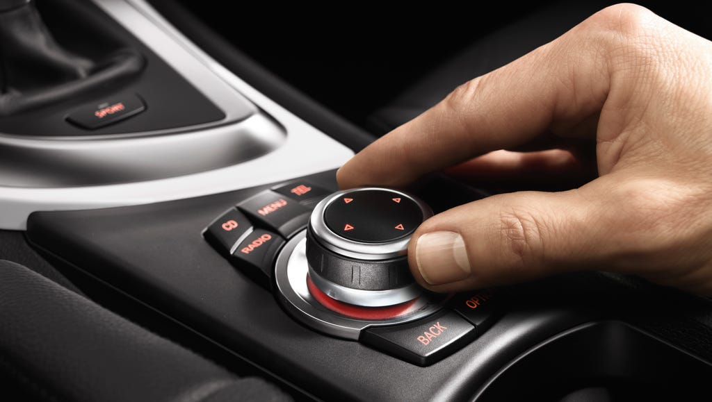
- In 2001 BMW launched iDrive rotary controller — a physical knob that falls naturally to hand, surrounded by tactile buttons under a sliver of wood trim. They cancelled it 25 years later.4
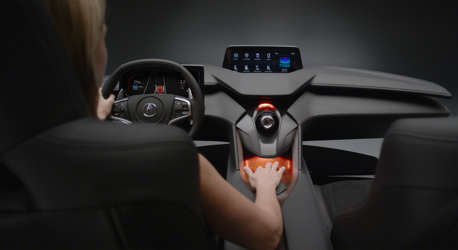
- In 2016, Acura’s released the “Acura Precision Cockpit” using a curved touchpad positioned in the center stack with a center display placed high on the instrument panel, close to the driver’s natural line-of-sight, ergonomically designed to eliminate the need to visually locate a button or switch. 5


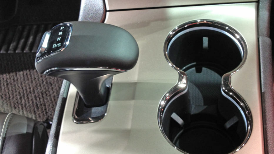
- In June 2016, Anton Yelchin, the actor famous for ‘Star Trek’, died when his Jeep Grand Cherokee rolled and pinned him. The cause: a “monostable” gear shifter that automatically returned to center after each use, leaving no physical cue about which gear was engaged. To go forward, you pulled back. To go backward, you pushed forward. There was no way to feel the state of the car. Fiat Chrysler recalled 1.1 million vehicles. 6
2020: Why the Touchscreen Triumphed
Automakers wanted to chase Tesla’s cachet and followed the template. Once the trend took hold, several forces sustained it.
-
Touchscreens are significantly cheaper to manufacture than arrays of individual physical controls which have to be assembled and wired. Software updates can change the interface without retooling a production line.
-
The EV transition gave manufacturers a chance to redesign interiors from scratch and EVs have less to show on the dashboard: no oil pressure, no tachometer. Google Maps became an essential driving requirement. New features, like adaptive cruise control, were invented. “Full Self Driving” was said to be only a few years away. It still is.
-
Big glowing dashboards look beautiful in car photographs. Tactile buttons and knobs do not. Every design balances users and marketing, and unfortunately, the car & tech press was not ready to evaluate function. To be generous, after so many years of technological stasis, car styling was the thing to write about.
The executives driving the trend had no shortage of rationalizations:
-
Stephan Durach, a senior vice president who leads BMW user experience: “If people see something, they want to touch it, so just make it touchable.”7
-
Melanie Limmer, the electronics boss for the new Audi A3, said the decision to remove some physical buttons from that car was because “more and more people are getting into touch functions with smartphones”. 8
-
Matthew Avery, director of research at leading UK automotive safety body Thatcham Research: “Large infotainment screens are not necessarily an issue, because they allow for bigger icons and less crowded displays. Small screens with fiddly icons are a greater concern.” 8
Harris Ramis, Google Android said “Safety comes in many forms. Today, people pull out their phones and use them while driving anyway, so when we started thinking about safety, we did so from the perspective of ensuring they have access to the services they want that are built for in-car use.” 8
Ödgärd Andersson, Volvo’s digital boss: “Voice commands make total sense when you’re driving.” Thatcham’s Avery agreed: “It brings clear benefits in keeping the driver’s eyes on the road. [but] Where the voice control fails to recognize what the driver is saying, the safety benefits are lost.” 8
“There was this kind of touchscreen mania, where all of a sudden everything became a touchscreen. Your car was a touchscreen, your refrigerator was a touchscreen. Over time, people became somewhat fatigued with that. - Rachel Plotnick” 9
From a car designer “With each new product release, the comment sections of articles and youtube videos are filled with negative remarks. Yet, carmakers are committed to the race of creating ever-bigger screens. If public opinion is so against touch interfaces in cars, why do car companies use them?” 10
2022–2026: The Reckoning
The reversal has multiple causes converging at once.
Safety research has become unambiguous.
Swedish automotive magazine Vi Bilägare tested 11 cars in 2022 and found physical buttons consistently faster and less distracting for common tasks. The worst-performing car needed 1,400 meters to complete simple tasks; the best needed 300 meters. The best-performing car was a 2005 Volvo V70 — a seventeen-year-old car beating every new EV by a factor of four.
Starting in 2026, European crash testers NCAP require physical controls for critical functions as part of safety scoring. The controls now mandated as physical: horn, indicators, hazard lights, windscreen wipers, headlights — exactly the controls that were moved to screens.
Matthew Avery, director of strategic development at Euro NCAP: “The overuse of touchscreens is an industry-wide problem, with almost every vehicle-maker moving key controls onto central touchscreens, obliging drivers to take their eyes off the road and raising the risk of distraction crashes. New Euro NCAP tests due in 2026 will encourage manufacturers to use separate, physical controls for basic functions in an intuitive manner, limiting eyes-off-road time and therefore promoting safer driving.”11 12
Highways England boss Jim O’Sullivan: “We don’t like them from a safety perspective.” 8
report published in January 2024 by the European Road Safety Observatory found that drivers engaged in distracting activities for about half of all driving time, with the main causes being using a mobile phone, adjusting infotainment systems, interacting with passengers and eating. 13
ANCAP, which provides crash testing for Australia and New Zealand, started deducting points for basic controls that weren’t separate, physical controls that the driver can easily operate without taking their eyes off the road. 14
“From 2026, we’re asking car makers to either offer physical buttons for important driver controls like the horn, indicators, hazard lights, windscreen wipers and headlights, or dedicate a fixed portion of the cabin display screen to these primary driving functions.” - ANCAP 14
“Touchscreens … cognitive and manual distraction increases the risk of accidents, particularly during critical driving moments,” - Stanley Hawkin, automotive expert at Vehiclechef 15
In the article, “If Cars With Touchscreens Are Unsafe at Any Speed, Why Do We Have Them?”, Maddie McCarty, PhD, a human factors engineer (ergonomics) at Consumer Reports: “Our research shows that it is easier and safer to use manual controls than a touchscreen to adjust your radio, volume, A/C, without even looking. With a touchscreen, you have to look, taking your eyes off the roadway. This is distracting and dangerous. People want those buttons and knobs back because they realize it is difficult to use a touchscreen to complete even the simplest task.” 16
Automakers Listened to Customers
Volkswagen CEO Thomas Schäfer publicly acknowledged that removing physical controls had damaged the brand: “We had frustrated customers who shouldn’t be frustrated.” these “frustrating” interiors “definitely did a lot of damage” among loyal customers.17 VW is now restoring physical buttons across its lineup. 18
Mercedes Head of Sales Mathias Geisen acknowledged that Mercedes has changed track on the use of physical controls, citing the return of physical ‘roller’ controls in place of haptic pads on steering wheels. “Customers told us two years ago, ‘guys, nice idea, but it just doesn’t work for us’, so we changed that and made it more analogue.”
Consumer Reports added a “Usability” rating to their car guide (formerly “Controls & Displays”): “Engineers trained in ergonomics/human factors evaluate a car’s controls and displays, judging how easy it is to interact with the various vehicle functions such as audio, climate, phone, and all the switches and instruments. Every auto-test staff member logs comments drawn from months of living with the cars and driving them every day for commuting, trips, and errands. The more intuitive and user-friendly the controls are, the better, and the higher score they receive.”19
Consumer Reports Survey — Auto Satisfaction functions evaluated (Summer 2022): 19
- Making calls
- Navigation
- Texting or emailing
- Controlling your radio (e.g., AM, FM, satellite radio)
- Controlling media (e.g., music, podcasts)
- Controlling climate system
- Turning the infotainment system on
- Using infotainment voice controls
- Apple CarPlay
- Android Auto
- Infotainment system
“Consumer Reports asks tens of thousands of people how they feel about their cars’ so-called infotainment systems. Every time, the largest, flashiest packages rank near the bottom in terms of satisfaction. Luxury brands fare particularly poorly, while more pedestrian vehicles — with a more utilitarian approach to technology — are rated more highly,” explains Jake Fisher, Consumer Reports’ senior director of auto testing.7
“A study by What Car? found that almost 90 per cent of drivers want buttons rather than touchscreen controls on their dashboards. These are sensible measures, guided not by a Luddite antagonism to progress but by the recognition that, sometimes, what looks like an upgrade is nothing of the sort.” 20
The application of new technology has a tendency towards mission creep, in which apparently smart operating systems are introduced simply because they exist, whether or not they actually benefit the average user. 20
In March 2023, Hyundai’s Head of Design Sang Yup Lee: “digital screens is often more dangerous, as it often requires multiple steps and means drivers have to take their eyes off the road to see where they need to press” — with “hard key it’s easy to sense and feel it.” 21
“safety-related controls need to remain operated by a physical button or dial. And by ‘safety-related’ [including] fundamental controls such as the air-con and stereo” 22
Even Apple’s former design chief Jony Ive, who championed the minimalist design style of removing UI affordances, weighed in: “the pendulum may swing [to] products that … are more engaged physically.” [^https://www.drive.com.au/news/former-apple-design-boss-physical-buttons-return-to-car-interiors]. His Ferrari Luce Dashboard has lots of buttons.
Even Tesla
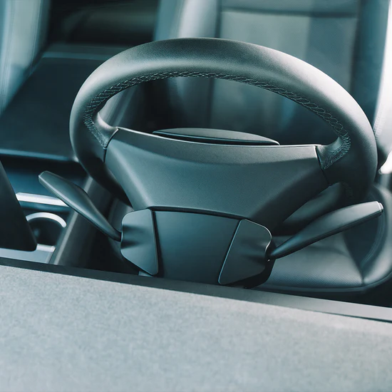
In the article, “Our Tesla Model 3’s Turn Signals Aren’t Just Dumb, They’re Borderline Unsafe And no, it isn’t just a matter of getting used to them” senior manager of written content Brent Romans writes “I don’t necessarily mind buttons… It’s the execution of the design that is faulty. you can’t intuitively feel where your thumb is supposed to go, and you have to press them just right, otherwise they won’t activate the turn signal.” 23. Senior news editor Nick Yekikian adds “Having to regularly take your eyes off the road to use a turn signal, or the chance that you accidentally signal the wrong way because of the lack of tactility, or the chance that you miss the button entirely are all big safety concerns that are straight-up baked into the design of these indicators.” 23
The popular Enhance Auto offers aftermarket turn signal stalks, knobs, buttons that people can install (~$1,000 USD for full package).
2027+: What Comes Next?
The emerging consensus is a hybrid model: physical controls for safety-critical functions (climate, volume, hazards), touchscreens for navigation and secondary features. It might be seen as a back to basics lesson that physical buttons still are the right choice in a lot of applications.
Some manufacturers are betting on voice control as the solution. Rivian has removed physical controls and its executives have praised the opportunity of voice controls. Rivian’s Chief Software Officer, Wassym Bensaid: “physical buttons are becoming an ‘anomaly’ in modern cars.” “Ideally, you would want to interact with your car through voice. The problem today is that most voice assistants are just broken,”24
Even buttons are changing. New manufacturing techniques integrate design graphics and backlighting, making physical controls look as refined as touchscreens while retaining tactile feedback.
The 2024 Skoda Superb’s “Smart Dials” — three rotating physical controls on the center console, each handling multiple functions with clear tactile feedback — show a vision of the hybrid future. 25
“Now that touch screens are the cheapest option, they’re being deployed everywhere, even in places where they don’t belong,” says Sam Calisch, chief executive of Copper 26
“the BMW iX has a touchscreen, but you’re not obligated to use it. BMW’s rotary iDrive controller falls naturally to hand, and there are permanent controls arrayed around it under a sliver of wood that both looks and feels interesting.” 27
Scott Bezek’s open-source Smart Knob project (a physical knob with configurable haptic feedback and a small embedded display)28 is a DIY project that at least one car designer has been exploring. The Subtle Art of Designing Physical Controls for Cars 29
Companies, particularly in China, are making both a cars and smartphones for a seamless experience. Xiaomi started as a phone manufacturer, which makes more sense when we think of EV cars as mainly being batteries.
Apple Carplay and Android Auto are going in different directions. Apple CarPlay Ultra seeks to expand to take over more of the car UI. “Android Automotive runs natively inside the car and any carmaker is free to use it. Google monetizes it by licensing its ‘Google Automotive Services’ to carmakers. This gives carmakers access to Google’s services like Google Maps, Waze, the Play Store, and Google Assistant. “[^theturnsignalblog-apples-risky-bet-on-carplay/]

The EV startup Slate Auto, has a totally different approach; just use your phone.
What do Car Designers Think?
Guillaume Bécourt, veteran automotive dashboard designer, Co-founder / Chief Experience Officer, User Shaker
” As a user you could feel the disconnection: the user interfaces was designed as independent product by tier 1 supplier, distinct from the overall interior design by the auto manufacturer. New companies like Tesla and Rivian are changing this, setting the new standard for phygital interior coherence. “
“5 year iteration cycles were normal in Automotive. A Dashboard designer is iterating based on feedback about the previous one, at least, 5 years old, but usually it’s already on the market. So, really 10 years old.”
“15 years ago, my conclusion was, touchscreens are the worst ergonomic option. It’s either too low to be seen, or too high to be touched. There’s no good position that does both… I did not win the battle, obviously.”
James Rampton, veteran car designer, Lecturer at University of Michigan, UX & Product Designer
“What I find so entertaining is that we are all trying to solve the same problem. How can I listen to my music, access my maps, and allow me to drink my beverage while not blocking me from turning up my A/C or tuning down my volume. In my experience it comes down to those basic things…Oh and make it look like it came out of Tony Stark’s basement. What I love about automotive design is that the actual content never changes. We all have volume, A/C, maps, and music. We also want to open our doors and adjust our seats. Every automaker is trying to do something innovative because no one wants to be seen as a follower. The idea of ‘If you ain’t first, your last’ comes to mind.”
“The idea of cost has taken it’s toll in this industry. What Tesla showed other OEMs is that we can save tons of money by moving more things into a screen. Look up the cost to produce F-150 interior controls and compare it to the cost of a Tesla Model 3 and you will be shocked. We often forget that cars are not just about design, but also cost. Oftentimes designers are forced to make decisions because product managers are trying to keep Tier 1 parts down below a certain amount.”
“My job as UX designer, and now an academic and a consultant, is rarely about teaching OEM executives about research, but about how to give them the freedom to design and come up with how to rearrange the same content in different ways. The good news is that I have never met a car designer or an executive that wanted to act like Maverick and do things that weren’t safe, however I have met plenty who wanted to be artistic and be expressive with their designs because ultimately this is an art form. Being a good artist means making people see the same thing differently. When was the last time we bragged about a 1990s Ford Taurus interior? Those cars defined the 90s and yet no one is going to see any of these anytime soon except maybe on a Hollywood lot.”
Design Principles
Here’s a distillation of the many good ideas from many designers, car enthusiasts, and safety enthusiasts.
Driving While Distracted
The European Road Safety Observatory found that drivers engaged in distracting activities for about half of all driving time, with adjusting infotainment systems among the primary causes.
Apple’s notifications of texts, ‘Find my’ notifications, etc are a serious distraction - in my short test they trigger peripheral vision and even cover up essential map information.
David Strayer, head of the University of Utah’s Applied Cognition Lab, puts it plainly: “taking your eyes off the road for about two seconds increases crash risk and that risk goes up monotonically over time.” 7
One of the worst issues with these screens, including the ridiculous TVs in the Teslas, is they tempt the driver to look away from the road. The designers are making choices for the touchscreen to compete with the windscreen.
The Tesla “video game” screen shows a version of the real world. For what possible benefit could overcome the distraction in the peripheral vision? (It does highlight how poor the Car’s vision is, with other people and vehicles appearing and disappearing in a flickering mess.) It is notable that the Tesla manual explicitly says “Use the cameras for guidance purposes only. It is not intended to replace your own direct visual checks”, but the giant screen blinks into action, pulling the drivers eyes away from the mirror they are instructed to use.
Eyes on the Road
The ‘tainment’ should be removed from ‘infotainment’ - make the UIs basic and not distracting. This would require designers to stop trying to add excitement to the designs. Perhaps there could be one mode when parked, satisfying the marketing guys. There is simply no need to show full color album covers. Designers could choose high contrast, low chroma images, more like an eInk screen than IMAX.
Apple and Google maps, perhaps trying to show off, include distracting details like building shapes in 3D. Including the nearest Dunkin Donuts speaks to their true motivation, at the expense of our safety.
CarPlay Requires the Touchscreen
The down sides of the touchscreen are well known, so we won’t repeat them. But CarPlay requires them, so bears responsibility. Thinking more broadly, CarPlay standard also enforces a single, rectangular shape; just like a phone. There must be other more interesting ways to design an experience.
Large technological change can be rough and take a while. Apple CarPlay Ultra launched 10 years later, addresses almost none of these concerns — it extends the phone-mirroring model deeper into the car’s systems, but doesn’t change the fundamental touchscreen interaction model. It offers car apps to “punch through” the Carplay UI, but not the other way around. It is notable that car companies have not rushed to adopt it. More car companies are building their own technology stack. The car interface is too important to leave to a distracted partner.
No Modes on Roads
People like physical buttons not only for the graspable control, but that buttons can’t change. The fan knob always controls the fan. A touchscreen is only the fan dial when you’re on the HVAC screen.
Jef Raskin’s influential 2000 book, The Humane Interface, argued that modes, where the same user input has different results depending on the system’s current state—trap users rather than liberate them.
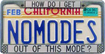
This is a very old complaint, back to the beginnings of computing. Larry Tesler, famed Xerox PARC inventor of Cut and Paste, had an admirable personal vendetta against modes, including his license plate.30
Buttons Work!
Rachel Plotnick, Indiana University in Bloomington, wrote the 2018 book Power Button: A History of Pleasure, Panic, and the Politics of Pushing31
“It’s always been funny to me that we call them touchscreens. We think about them as a touch modality, but a touchscreen prioritizes the visual.” 9
Capacitive buttons are widely disliked
Capacitive buttons are a solid piece of plastic that conducts the tiny amounts of electricity the human body generates. Very cheap to manufacture, they are typically black plastic with no moving parts. Users find them tough to use without looking as they activate instantly when touched, unlike the typical human behavior of lightly touching a button before pressing down.
“Volkswagen and Seat touch-sensitive climate controls below the screen in the ID.3 and Leon are not backlit which make them completely invisible at night.” 32
“Volkswagen’s ID.4 ‘RES’ button on the steering wheel … accelerates to the last speed memorized by the system. If no speed is memorized by the driver, the car accelerates to the same speed as the last speed limit sign – in this case, 40 km/h (25 mph), according to technical experts from Volkswagen who testified in court.”33
Haptics are not a replacement for buttons
Haptics, or the implementation of tiny motors or subsonic speakers to simulate a click or press has been widely touted as a solution to the “dead” capacitive button.
“Confirmation feedback is good, but it’s the hunting for buttons before confirmation that’s often the annoying aspect of dealing with capacitive keys.” 34
“Hyundai research in Haptic screen replacements revealed that customers didn’t actually know what some steering wheel buttons were for.” 35
Ultraleap’s mid-air haptics, still in development, produce a tactile sensation in a fingertip hovering above a surface and may result in touchscreens that feel like a button.
What Needs to Change
Ultimately, the solution has to happen at the societal level.
- We can pass legislation to require phones to ‘unbundle’ the apps and let them run in a window in the car UI. If phone OS’s can be told unbundle browsers and mail clients, Cars should be able to set a default phone app, maps app.
- Test UI distraction in real world scenarios and hold car makers liable. Drug makers have to publish test research, cars should have to as well.
- Apply social pressure on Apple and Google to embarrass them into trying new things or unbundling their apps.
What can we learn from this story?
- Sales really have no idea what customers want. Designers need to advocate for the driver, not the purchaser.
- Tech press has a bias to hype change, coverage is not a proxy for what people want.
- Customer sentiment is slow to catch up, but reputational damage is hard to reverse
Ultimately, the solution is innovation! I’m pleased to see that carmakers are breaking from the Apple/Android duopoly. The reason CarPlay and the automakers have not been able to deliver an integrated design is more related to a battle between corporations than design priorities.
Ideally, the car designers would be empowered to integrate the most important elements, not a menu of app icons. Customers could choose between companies design strategies. Hopefully this will encourage new ideas, new forms. Why does it have to be a flat screen placed way below where the driver should be looking? There are so many other potential forms. Maps would be much better as a Heads Up Display. The bottom of the windscreen is completely dead space, enough for a ribbon screen across the dashboard.
Let’s not make this mistake again!
Let’s learn from this episode to avoid the next dangerous trend - giant screens the size of the dashboard.
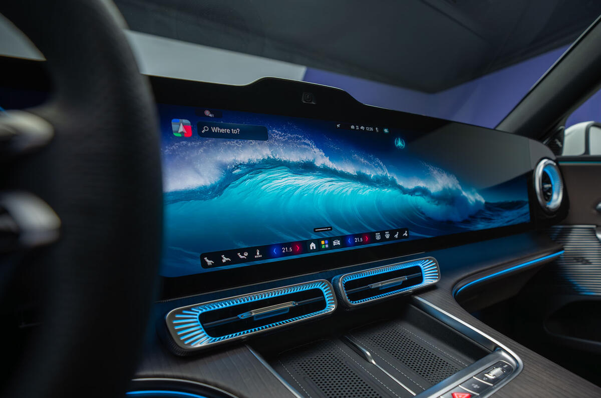
Mercedes illustrated the reductio ad absurdum: the “Hyperscreen” stretched 56 inches of touchscreen across the entire dashboard — three separate displays, eight processing units. The key feature customizable “wallpaper”. Head of Sales Mathias Geisen said “If you have a seamless screen of roughly a metre with ultra-high resolution and you put wallpapers on it, you put pictures of your kids on it, it means you can individualise the interior not only on the hardware side but also on the software side.” 36. Sales guys will say anything, but this is desperate.
Closing Reflection: Our Experience
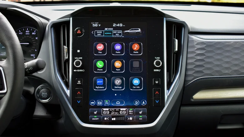
Luckily for my family, we snoozed through the CarPlay battles and automakers are learning. Subaru’s new screen works around CarPlay by putting it in a portion of the screen, with the HVAC controls below, and other features above. It’s a bit like 90’s websites made with iFrames. It’s not elegant, but it works. If only it was designed.
By 2026, the frustration had gone mainstream enough that comedians noticed. One YouTube comment on the SNL sketch: “this is basically the most realistic explanation for why car doors suck now”
Footnotes: Dashboards in the News 2016-2026
-
19 Jun 2017 ScreenDrive: Tesla Model S is the epitome of a tablet on wheels The Tesla Model S embodies the whole “rolling tablet” concept more than any other car I’ve driven. When I first saw a Tesla Model S in a mall showroom back in 2012, my initial thought was that such a massive interactive display would inevitably be a distraction while driving. The 17-inch tablet ended up being much less distracting than I thought it would be. The Easter eggs buried in the software of the Tesla Model S underscore that it’s a car for tech geeks ↩ ↩2
-
19 May 2019 Tesla’s Touchscreen UI: A Case Study of Car-Dashboard User Interface ↩
-
30 May 2019 -
7 January 2025 BMW Kills Off the iDrive Knob After 24 Years “It was not easy for us,” said Joern Freyer, BMW’s head of user interaction, when asked about dropping the iDrive knob. What drove the decision, Freyer tells us, was data. Drivers of BMWs are trending more and more toward operation via touch control and leaving the iDrive knob unused. Color us unsurprised: more recent versions of iDrive (8, 8.5 and 9) move away from an interface that favors scroll-wheel control to one more easily navigable via fingertip. ↩
-
5 Dec 2016 Acura Rethinks HMI Acura’s “Acura Precision Cockpit” HMI uses a curved touchpad positioned in the center stack with a center display placed high on the instrument panel, close to the driver’s natural line-of-sight, ergonomically designed to eliminate the need to visually locate a button or switch. ↩
-
20 June 2016 When Bad UI Design Kills: Is Poor Shift Lever Design to Blame for Death of Star Trek Actor? “Monostable” shifter automatically returns to the center position after each change is made. The driver must check the letters atop the shifter or on the dashboard to see what gear it’s in. In contrast, the more traditional automatic shifter design is to move the lever to a particular angle, where it remains. ↩
-
13 February 2023 -
17 April 2020 -
3 Nov 2024 -
1 March 2021 -
report published in January 2024 by the European Road Safety Observatory found that drivers engaged in distracting activities for about half of all driving time, with the main causes being using a mobile phone, adjusting infotainment systems, interacting with passengers and eating. ↩
-
14 Jan 2026 Is 2026 the year buttons come back to cars? Crash testers say yes. ↩ ↩2
-
7 March 2024 Could Touchscreens in Cars Be on Their Way Out Already? Let’s Hope So “Touchscreens can be dangerous in cars due to their inherent distraction potential. Unlike physical controls like knobs and buttons, which allow drivers to operate without taking their eyes off the road, touchscreens require visual attention and precise finger interaction. This cognitive and manual distraction increases the risk of accidents, particularly during critical driving moments,” Stanley Hawkin, automotive expert at Vehiclechef ↩
-
30 April 2024 If Cars With Touchscreens Are Unsafe at Any Speed, Why Do We Have Them? Maddie McCarty, PhD, a human factors engineer (ergonomics) at Consumer Reports: “Our research shows that it is easier and safer to use manual controls than a touchscreen to adjust your radio, volume, A/C, without even looking. With a touchscreen, you have to look, taking your eyes off the roadway. This is distracting and dangerous. People want those buttons and knobs back because they realize it is difficult to use a touchscreen to complete even the simplest task.” ↩
-
20 Jun 2023 VW CEO Admits ‘Frustrating’ No-Button Interiors Have Damaged VW’s Reputation “We had frustrated customers who shouldn’t be frustrated,” VW CEO Thomas Schäfer recently told Autocar. He even went as far as saying that these “frustrating” interiors “definitely did a lot of damage” among loyal customers. Then there’s the ID.4, which only has two window switches on the driver’s door, with a separate button that shifts their controls between the front and rear windows. It’s an overly complicated solution to a problem that didn’t exist. ↩
-
12 September 2022 Consumer Reports added a “Usability” rating to their car guide (formerly “Controls & Displays”) ↩ ↩2
-
21 March 2024 The Times view on car controls: Driven to Distraction A study by What Car? found that almost 90 per cent of drivers want buttons rather than touchscreen controls on their dashboards. These are sensible measures, guided not by a Luddite antagonism to progress but by the recognition that, sometimes, what looks like an upgrade is nothing of the sort. The application of new technology has a tendency towards mission creep, in which apparently smart operating systems are introduced simply because they exist, whether or not they actually benefit the average user. ↩ ↩2
-
18 Mar 2023 Hallelujah! Hyundai vows to resist modern trend for all-digital cabins and keep using buttons and dials ↩
-
27 June 2024 Our Tesla Model 3’s Turn Signals Aren’t Just Dumb, They’re Borderline Unsafe And no, it isn’t just a matter of getting used to them. Senior manager of written content Brent Romans: “I don’t necessarily mind buttons… It’s the execution of the design that is faulty. you can’t intuitively feel where your thumb is supposed to go, and you have to press them just right, otherwise they won’t activate the turn signal.” ↩ ↩2
-
26 Nov 2025 2024 Skoda Superb review — physical knobs praised The Skoda Superb Estate uses clever ‘Smart Dials’ on the centre console in a quest to bring back physical controls. A set of three rotating controls can be used to control various functions, with the outer dials used to control the temperature of the two front climate control zones, plus the heated or (if fitted) ventilated front seats, while the middle display handles four different functions, including the fan direction and drive modes. ↩
-
1 February 2025 -
01 Aug 2005 Of Modes and MenCut-and-paste, the one-button mouse, WYSIWIG desktop publishing—these are just a few of the user interface innovations pioneered by Larry Tesler ↩
-
17 August 2022 Physical buttons outperform touchscreens in new cars, test finds “The worst-performing car needs 1,400 meters to perform the same tasks for which the best-performing car only needs 300 meters.” The easiest car to understand and operate, by a large margin, is the 2005 Volvo V70. The four tasks is handled within ten seconds flat, during which the car is driven 306 meters at 110 km/h. Dacia Sandero and Volvo C40 perform well although they both have touchscreens. However, they are not overloaded with features. Volvo shows that a touchscreen doesn’t need to be complicated. ↩
-
27 April 2026 BMW’s iDrive Knob Killed Off for Haptic Controls and a Wall-to-Wall Screen 2026 BMW iX3 paves the way for what’s to follow: Plenty of steering wheel controls and a really big screen. ↩
-
17 June 2019 Under the skin: How haptics are making touchscreens safer “Hyundai … research … in Haptic screen replacements are also being developed for steering wheel switchgear after early research revealed that customers didn’t actually know what some steering wheel buttons were for.” ↩
-
27 April 2026 Mercedes to reintroduce buttons – but stick with big screens Sales boss Mathias Geisen acknowledged that Mercedes has changed track on the use of physical controls, citing the return of physical ‘roller’ controls in place of haptic pads on steering wheels. “Customers told us two years ago, ‘guys, nice idea, but it just doesn’t work for us’, so we changed that and made it more analogue.” ↩