A Tangible Talk with Amber Case on Calm Technology
Interview conducted July 30, 2026
For my forthcoming book, Designing the Tangible Interface, Amber Case of Calm Tech Institute was kind enough to speak with me!

Amber Case is a designer, speaker, and author best known for popularizing the term “calm technology”: the idea that technology should demand the least possible attention and provide a pass-through experience for the user. Does a car disappear when you drive it? How about a book when you read it? When an interface is designed well, we get used to it. The experience dissolves and it becomes a “pass through” interface.
In 2015, Amber Case wrote the seminal book Calm Technology, which provided an alternative design theory to the “in your face” kind of attention grabbing, blue LED, screen-searing megalopolis of the present moment. In it, she wrote that attention would be the scarcest resource of the future, and technologies that worked against attention would be difficult to use and eventually fail.
The book laid out her eight design principles:
- Require the smallest possible amount of attention
- Inform and create calm
- Make use of the periphery
- Amplify the best of technology and the best of humanity
- Communicate, but not always with voice
- Work even when it fails
- Use the minimum tech needed to solve the problem
- Respect social norms
In response to growing demand for a checklist about whether a product was “Calm” or not, she set about to create a scoring system for products. Case realized that historically, slow rolling certification bodies like CE, UL, and even the Good Housekeeping Seal of Approval, had an outsized effect on changing industries. By creating a certification, which she deemed “Calm Tech Certified®,” Case wrote down 81 measurements for creating better products.
In 2024, Case founded the Calm Tech Institute, an organization with a commitment to educating the next generation of designers, and evaluating products across attention, periphery, durability, light, sound, and materials. As of 2026, over 80 products from around the world have been certified, and some products have been changed before release.
Why does a physical control feel so different from a touchscreen?
The human brain processes physical tasks differently than it handles touchscreen tasks. Neuroscientists describe this loosely as a division between automatic, procedural processing rooted in older subcortical structures (the cerebellum, basal ganglia, sensorimotor cortex) and deliberate, attentive processing concentrated in the prefrontal cortex. For ease of reading, we’ll call these the front brain and back brain.
The back brain operates without conscious supervision. It is where a trained driver finds their hand touching the turn signal as they prepare for a lane change, and where a musician’s fingers find the next chord after they’ve learned how to play a song. This system is fast, parallel, and cheap. It runs in the periphery. It doesn’t require us looking.
The front brain is the opposite: slow, sequential, and metabolically expensive. It is engaged when something requires reading, decision-making, or active attention. When an interface demands front-brain processing in a context that previously ran on back-brain automaticity, the cost is not just inconvenience. It is attention removed from wherever it was before.
Calm technology, at a neurological level, is technology designed to route through the back brain wherever possible. This is why the choice of a physical dial over a touchscreen slider is actually a crucial way to build better products.
What would you recommend to designers who want to make calmer products?
-
Light: Avoid overly bright indicator LEDs. Blue LEDs in particular tend to be brighter than their environment, creating a focus on themselves, especially at night. Diffusing the light helps it blend into the environment rather than intrude on it, but using a small orange, diffused LED is best.
-
Periphery: Use physical buttons. Invisible technologies lack the feedback that people need to develop a relationship with them. Your mind has to make up for the invisibility in other ways, adding a cognitive strain and microfriction to their usage. If you have voice-controlled lights in your house, for instance, you have to remember what you taught Alexa to call them: the “upstairs lights” or something else? A light switch uses a different part of the brain, an earlier and faster one. You don’t have to go into your prefrontal cortex to make a decision on what to say. You just hit the light switch. Unlike voice command, the light switch never changes shape or state. It just is.
-
Materials: Consider CMF (Color, Material, and Finish) and how these will affect the experience of the product. Most technology looks like a flat grey, and there’s an opportunity for color, highlights, harmony and subtle texture.
What does a tangible button offer that a touchscreen can’t?
Why is our sense of touch so good at our fingertips? The fingertip is a sensory organ with an extremely fine infrastructure. A finger moving across a surface is gathering multiple streams of information simultaneously, much of it processed before conscious awareness.
Vallbo and Johansson’s foundational research, conducted in the 70s, identified four types of mechanoreceptors in the human hand, each responding to different stimulus qualities: fine spatial detail, skin stretch, low-frequency flutter, and high-frequency vibration.
A physical button delivers information in many ways. The resistance of the press tells the finger how far the button has been pressed. The release provides another signal: the button has been pressed.
The button can be pressed without looking.
A touchscreen must be looked at. Tactile interfaces matter most in contexts where eyes and attention need to be elsewhere: driving, cooking, or caring for a child.
What are some products that get this right?
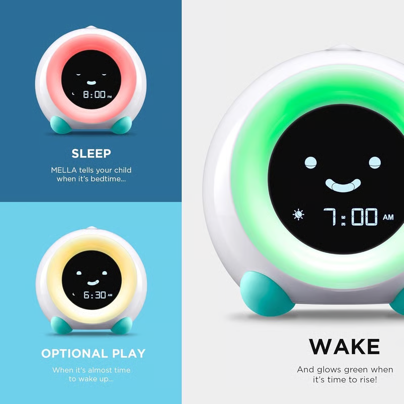
Little Hippo Mella Ready to Rise uses color to tell a kid when to wake up in the morning.
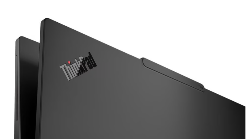
ThinkPad laptop line (T14/s Gen 6/7 and 7 other models), for their raised tactile affordances, physical privacy switches and red light indicator, plus eco-friendly packaging.
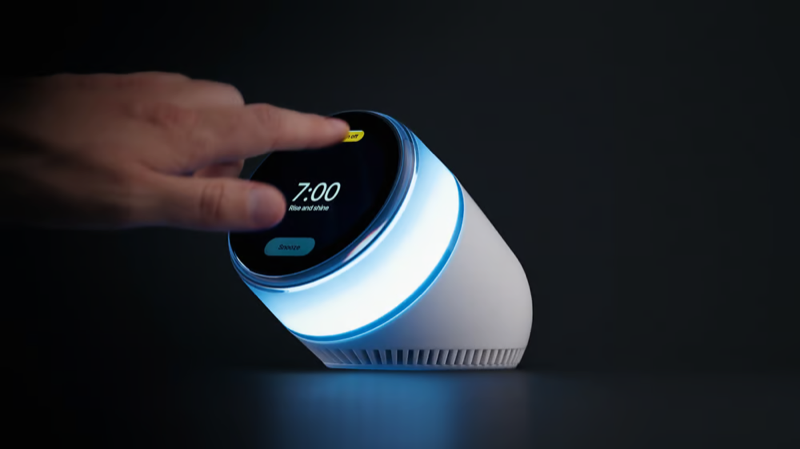
Dreamie, a flicker-free bedside companion without any blue light, removing circadian rhythm disruptions.
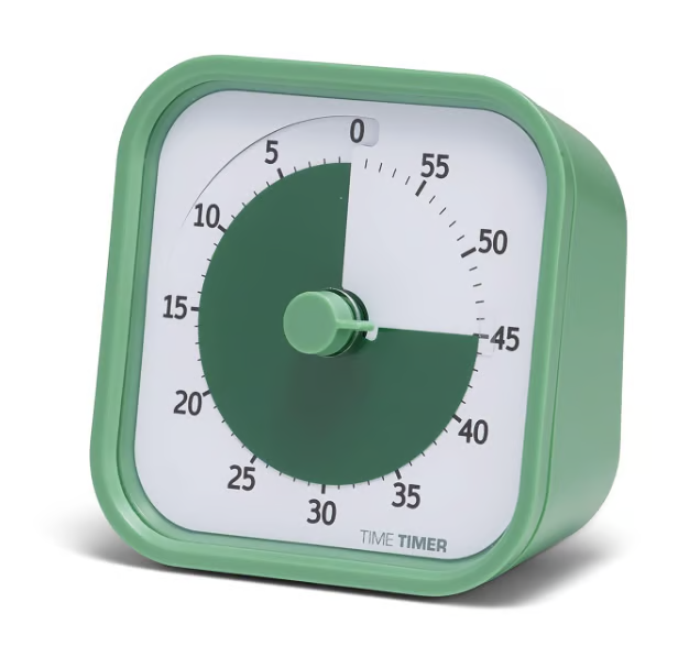
Time Timer, a physical timer for getting things done, available in a panoply of colors and sizes. Easy to see across the room.
Can you contrast a calm design with an anxious one in the same kind of product?
For most of the twentieth century, a car dashboard was a peripheral information environment. Analog gauges for speed, fuel, and engine temperature were positioned within the driver’s visual field but did not require reading. A trained driver could register the position of a speedometer needle without directing focal attention to it, the same way a person can sense whether a room is warm without consciously measuring the temperature. The interface operated at the edge of attention.
Beginning in the 2010s, automakers began migrating controls from physical buttons and knobs to large touchscreens. The rationale was flexibility: a screen can display any interface, updated by software. What this gained in reconfigurability, it cost in habituation.
Physical controls encode information through position, shape, texture, and resistance. A driver who has reached for the climate controls a hundred times develops a spatial and muscular memory for that action. They can execute it without looking. A touchscreen offers none of these affordances. It is a flat glass surface that presents the same physical feedback whether the user is adjusting fan speed, changing a radio station, or accepting a navigation route. Every action requires a visual confirmation that the action was registered. Every action demands front-brain attention.
The AAA Foundation for Traffic Safety research on infotainment systems documented the difference in task demand across input types, finding that visual-manual tasks such as tuning the radio or entering navigation via touchscreen require significantly longer glance-away time than equivalent tasks on physical controls.
In recent years, several automakers have reversed course. Porsche, after criticism of the touchscreen-only Taycan, added a physical volume knob. BMW retained physical controls on models where competitors moved to fully digital. These decisions reflect customer feedback, but the underlying driver is the same: physical controls offload cognitive work from front to back.
There is now European regulation for putting physical buttons back in cars to achieve higher safety ratings, but the question is why the buttons were allowed to be removed in the first place. Hopefully we will not have another moment where the story of the “new flatness” from iPhone and Tesla outweighs human experience.