There Is No Frequency for Magenta
In 2015 a bizarre internet debate arose over the color of a dress. People couldn’t agree on whether it was blue and black or white and gold; even worse, it upset them to know other people could disagree on such an obvious fact. It’s fascinating for another reason; it shows the eye is not a camera. We don’t see reality, we construct reality.
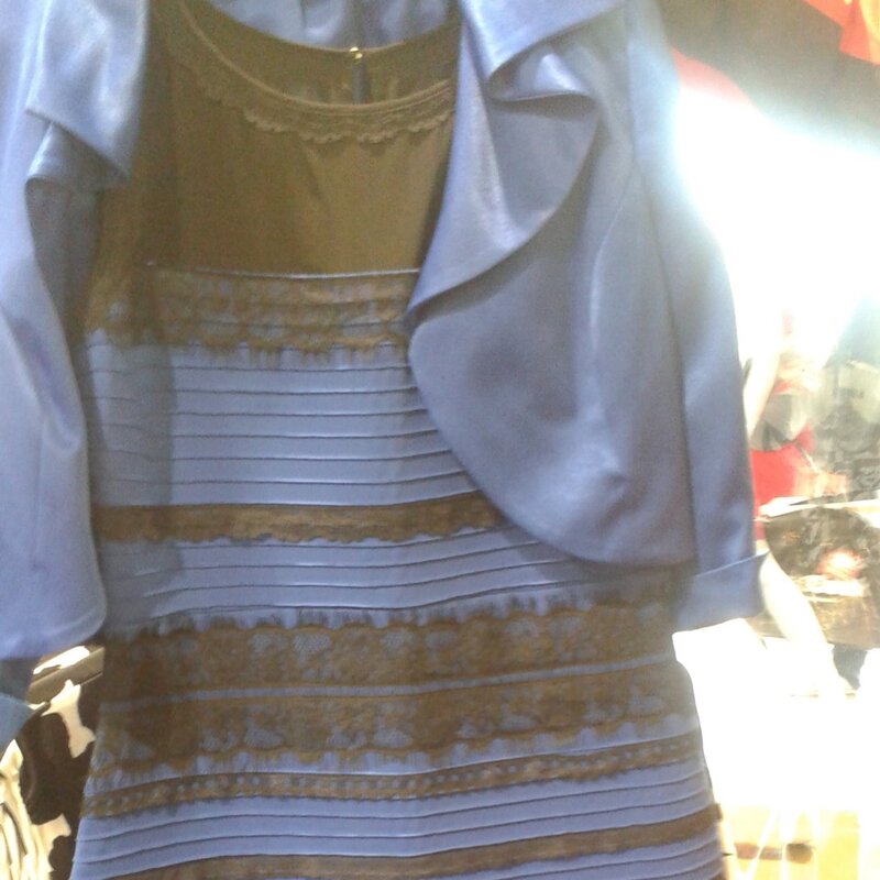
Neuroscientist Pascal Wallisch said the differences in perception was due to our assumptions about how the dress was illuminated.
The original image was overexposed, rendering the illumination source uncertain. People color correct images all the time. In this case, some people thought the dress was in a shadow and mentally subtracted the blue light, which then appears as bright gold and white. On the other side, thinking the dress was artificial light they mentally subtracted yellow, which then appears as dark black and blue dress.
Vision is not a passive recording device, the brain is continuously interpreting all the senses to construct a model of reality, and heavily dependent on context. What we experience as “reality” is a stabilized inference, not raw input. The brain cares about different things than you do; it is constantly solving “where is the lighting from?” before “what color is this object?”
Designers prioritize sight above all other senses, but our intuition hides surprising blind spots. More than a third of the brain is involved in visual processing in some way, perhaps more than all other senses combined, but learning how sight works offers opportunities to design engaging experiences.
There is no Frequency for Magenta
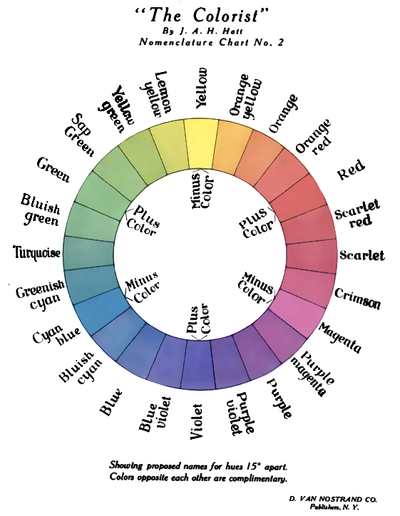
Every designer has used a color selector in design apps, but have you noticed the strange way it looks? The color spectrum user interface component sweeps hue (aka color) from left to right, like the classic color wheel. Red sits at both ends, closing the wheel. The six traditional hues Red, Orange, Yellow, Green, Blue, Violet, are defined as exactly 60° apart.

But wait! You also know that color is a frequency of light, the small part of the electromagnetic spectrum that we can see. They look similar, but Cyan and Magenta are missing, yellow is barely there. Also, the spectrum doesn’t loop like a color wheel. How can both these be true? The answer is deeply weird, very human, and essential to designing for sight. Designers use color every day, but few understand how it works.

The visible wavelength is real, in the physics sense, a continuous linear range around 380–700nm (nanometers). Violet and red sit at opposite ends; every point is a physically measurable light frequency.
The color wheel and color picker are also real, perceptually. Red and violet/blue are adjacent in a loop measured in a “hue angle” of 0–360°. Magenta is the “seam” that closes the circle; magenta does not have a frequency at all, it’s invented by your visual system.
The Secret: Your Eye Doesn’t See Colors
Answering this conundrum powered the scientific revolution and only was answered with dedicated scientists across biology, physics, and psychology. Your eyes have three types of color detecting “Cone” cells, sometimes described seeing Red, Green, Blue, but the eyes and brains are much cleverer than that. Scientists call the cones short, medium, and long (S, M, L) for their peak wavelengths, but they respond to a range of wavelengths that highly overlap.
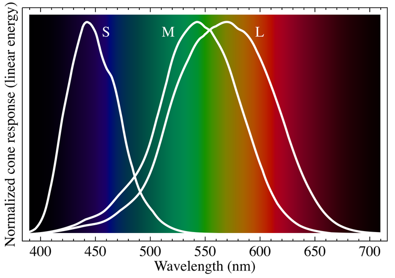
Magenta is the color your eye sees when it gets pure red and blue light frequencies (but not green) at the same time. The L and S cones fire; the M cone stays quiet. Your brain has no single wavelength that explains the combination, so it invents one — magenta.
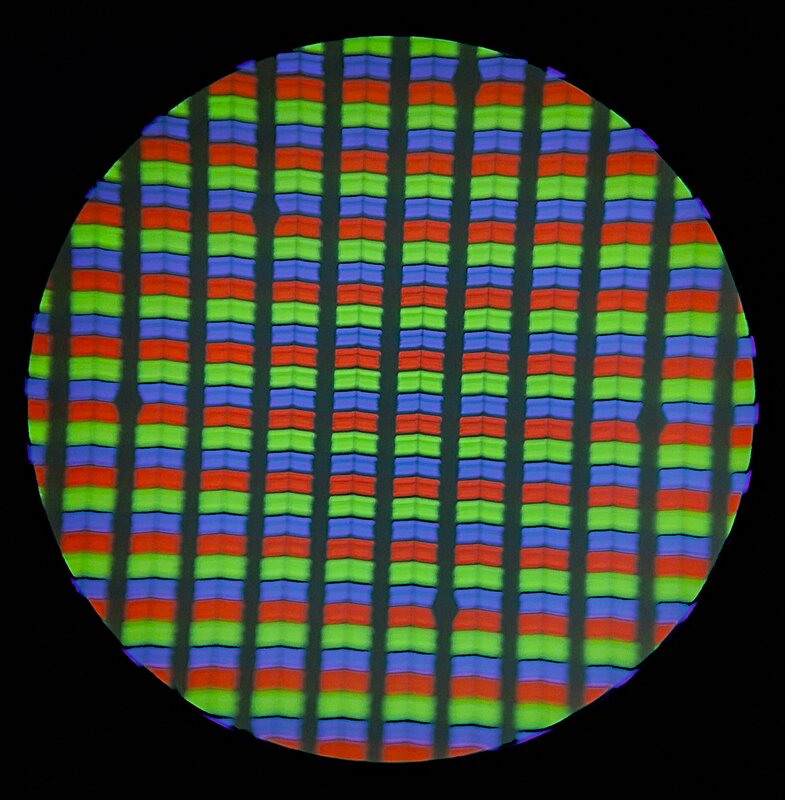
A magenta ink has microscopic particles reflecting red and blue. Technology has a similar solution: screens have small red, green, and blue pixels.
This mixing is used to create all colors, “real” or “fake”. An RGB screen has no yellow sub-pixel; yellow on a monitor is red and green LED that your M and L cones can’t distinguish from real 580nm yellow.
Take another look at the hue/brightness bar. Notice that the yellow, cyan, and magenta colors are narrower and brighter; red, green, and blue are wider.
-
Green and red look wide, but yellow looks narrow because L and M cones both respond to very similar wavelengths with a slight offset. That means the red-green channel crosses from “reads as red” to “reads as green” very gradually. Yellow requires positive blue-yellow signal paired with neither red nor green, which only happens in a narrow region.
-
Colors that light up two cones and suppress the third appear brighter to us. Yellow activates L and M (not S), cyan activates M and S (not L), magenta activates L and S (not M). White of course activates all three cones, so appears brightest.
-
The L cone has a small secondary bump of sensitivity at the violet end, which is part of why violet already looks faintly purplish rather than pure blue, helping the spectrum look more like a loop.
You have reached the end of the biology of color. Feel free to impress people at cocktail parties.
Why did I learn RYB in Art School?
One of the pleasures of art school is learning color theory. We used Color-aid sheets and mixed paint to (attempt to) achieve various hues. We learned the theory of additive and subtractive color, complementary and contrasting colors.
But why did we focus on Red Yellow Blue? Why not use RGB? or even CMYK? In one sense, it doesn’t matter. If you look on a color wheel, red–cyan, green–magenta, and blue–yellow are complementary pairs, two sides of the same spectrum.
Part of it was cultural. Josef Albers Interaction of Color (1963) was the core pedagogical text in art and design schools. It traces back to the Bauhaus preliminary courses, which he taught, and further back to Le Blon and Goethe’s Theory of Colours, which set itself explicitly against Newton’s RGB. Art school inherited the anti-Newton branch — a color wheel built on pigment intuition, not light. Painters study subtractive color theory because you build color by removing light from white paper. Glowing screens add light as you add colors.
Secondly, it was what ancient people knew. Stable cyan and magenta pigments are a modern invention. If you think about it, RYB is a weak version of CMYK, just rearrange the letters to “BRY.” Red is close to magenta, blue for cyan; close enough for people who needed to literally dig red and yellow ochres out of the ground. Blue pigment, ultramarine, ground from lapis lazuli was often more expensive than gold.
Don’t forget black; as a “mediocre” painting student like me knows, mixing all the colors together does not get you black; you get a terrible brown. To paint nighttime scenes, you really need to add black.
Which is not to say that academic color theory is useless! The iconic orange and pink colors of the Dunkin’ Donuts logo, chosen in 1976 by my teacher, Lucia DeRespinis, illustrates the power of unusual color pairing. The hues are roughly 60° apart, with high saturation and high value, creating vibration rather than calm harmony.
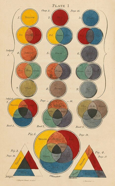
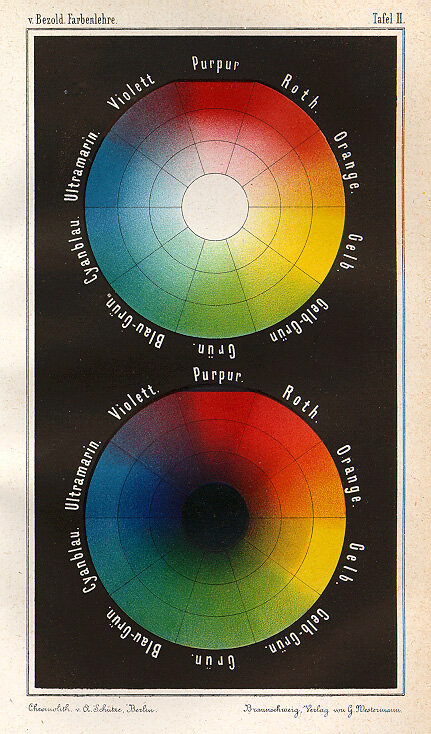
Color Theory History Montage
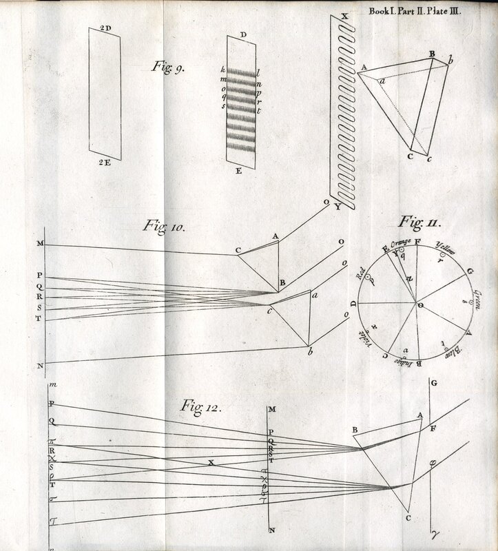
Isaac Newton’s branch was physics: prisms, wavelength, the spectrum as a measurable line. He invented Indigo to make it 7 colors to correspond to the musical scale because he believed light and sound shared an underlying mathematical harmony. It was a different time in science!
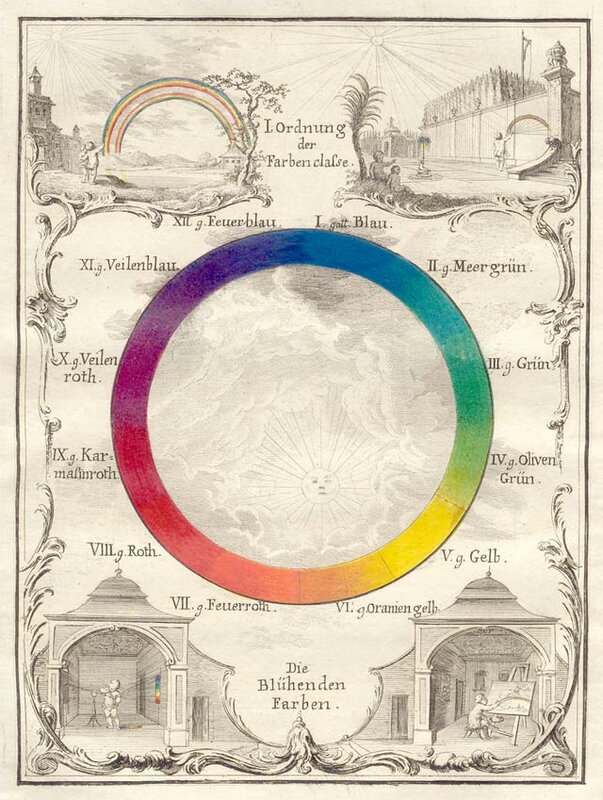
Johann Wolfgang von Goethe hated it. His 1810 Theory of Colours was explicitly written against Newton — colors, to Goethe, were a matter of perception and psychology, not just optics, and he arranged them as a wheel to prove the point.
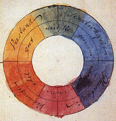
Some of the most famous people in history went slightly bonkers grappling with color theory. What is color? Is it light? Is it the pigment? Is it a perception? Isaac Newton and Johann Goethe disagreed and design school still hasn’t fully recovered from the split.
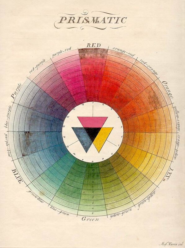
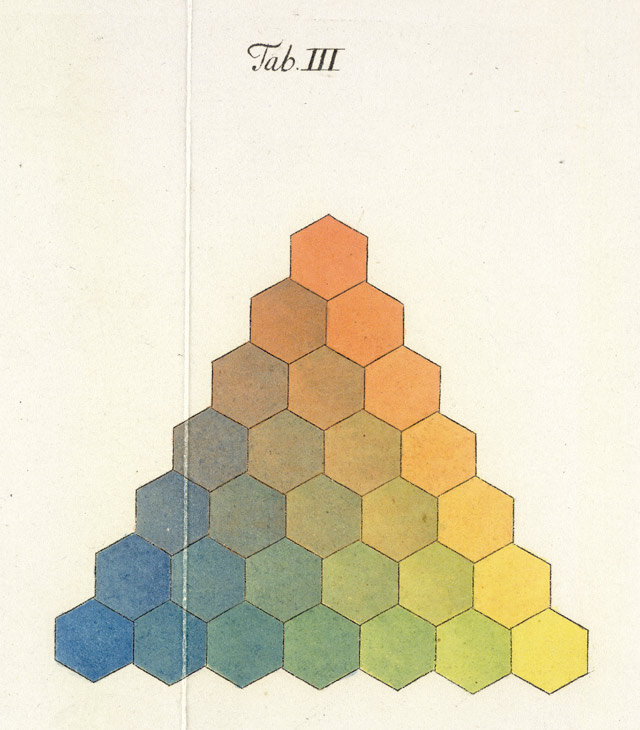
Tobias Mayer made a triangle in 1775 precise enough that 18th-century printers could use it to reproduce a specific hue on demand — an early attempt to turn color mixing into something closer to a recipe than an art.
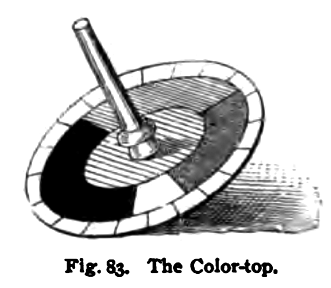
Maxwell used a spinning top to make various colors by changing the ratios of the primaries he used: vermilion (V), emerald (EG), and ultramarine (U).
The Full Gamut
“The full gamut” is an old word phrase the complete range, from the lowest note on the scale a singer could produce (gamma) to the highest (ut). For hundreds of years, scientists, designers, and manufacturers have been struggling to show more colors, but also make the same colors look the same.
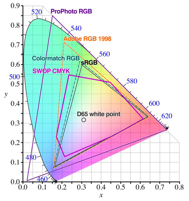
Most designers have seen color gamut diagrams, a sort of rounded triangular shape with a rainbow of colors inside of it, the specific range of colors a camera can capture or a display/printer can reproduce. After all the color battles, in 1931 the Commission Internationale de l’Éclairage (CIE) aka the International Commission on Illumination did research to define all of the colors humans could see. The experiment took a number of colors at specific wavelengths; volunteers adjusted red, green, and blue color filters till the colors matched. This research was then normalized, in a mathematical formula device manufacturers share.
You may have seen it in professional photography tools like Adobe Photoshop. The problem it solves is each device captures or renders colors in a slightly unique way; how to make the colors conform from film to sensor to screen. Also, a camera sensor cannot capture every possible color; storing all that data would take too much space. Compromises are made and a subset of all visible colors is defined — that subset is the device’s color space.
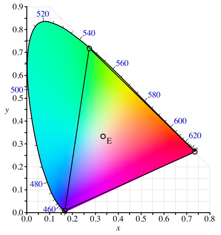
Three primary colors drawn as points should make a triangle, but when the 1931 volunteers tried to match certain saturated colors using only red, green, and blue, no combination worked. The real color was more saturated than any RGB mix could reach and the straight triangle had to be bent out to the curved horseshoe you’re looking at.
The CIE 1931 color space chromaticity diagram is a bit of an odd bird, but very widely used. Though it was originally made from human observations, it is not meant to define human vision. It has become a technical reference that manufacturers can use. The chart dimensions do not represent colors, but are abstract relationships between colors.
Other chromaticity models are more accurate, and scientists continue to research color questions like:
- Some cultures don’t differentiate between green and blue, as the English language does. Do they match colors differently?
- How does the age of viewer affect color perception?
- Is color the same for still and moving images?
sRGB is for Hardware
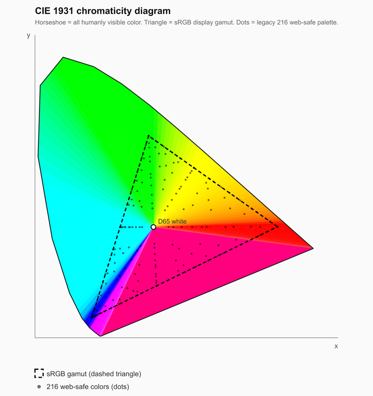
CIE defines a standard for reality, which is to say hardware; it is used for camera and monitor calibration, gamut definition, cross-device matching, etc. sRGB (Standard RGB) is a color space; a specific, bounded subset of CIE, defined by three real primaries (specific chromaticity coordinates), a white point (D65), and a tone curve (gamma ~2.2). It is a triangle inside the CIE color space — and a fairly small one. sRGB can render only 35% of human-visible colors.
Designers of a certain age may remember the Windows/Apple battle over “Gamma,” the relationship between the numeric RGB value and actual displayed brightness, which in the 1990s made Mac screens look brighter/lighter in midtones compared to the same file on a PC which looked more contrasty/darker. This difference was a real headache for web designers — an image color-corrected on a Mac could look noticeably darker and more saturated when opened on a PC, and vice versa. Around 2009, Apple gave up its more sophisticated ColorSync platform to match PCs using sRGB/2.2, which simplified cross-platform web content.
HSB is for UX Designers
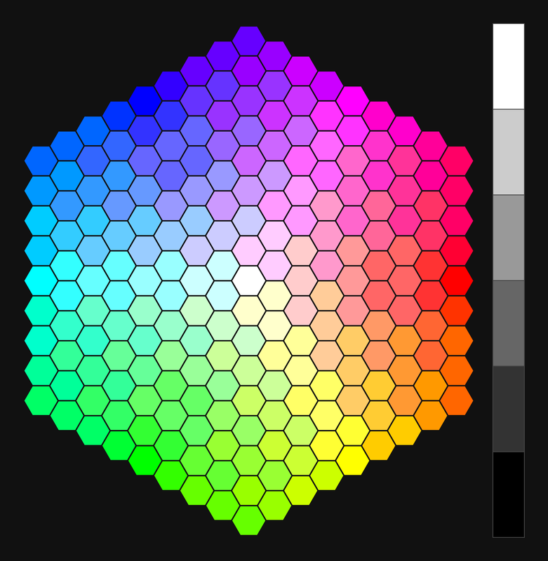
Digital designers live in a virtual world and use another color model based on Hue Saturation Brightness (HSB). HSB is created from ideal RGB colors, stretched with math into a cylinder, so hue is represented by an angle. The color wheel has 6 “named” landmark colors — red, yellow, green, cyan, blue, magenta — sitting exactly 60° apart. So a perfect red is represented by Hue 0°, Saturation =100%, Brightness=100%.
The key detail for designing colors on a screen is how many you have. “Bit depth” is how finely you subdivide the color spectrum, 8-bit is 256 slices, which is why old school 8-bit arcade graphics have visible bands. 24-bit color (aka “true color”) — 8 bits per channel (R, G, B), or 16,777,216 colors. Some displays now do 10-bit per channel (30-bit, “deep color”), used for HDR content — that’s over a billion colors, but 24-bit remains the standard baseline.
HDR is amazing, but when designing hardware, you immediately come to limitations of memory and processing power, so a trip down hardware history is helpful.
8-bit RGB still lives in web programming hex colors. #FF0000 (pure red) is simply #[Red][Green][Blue] where FF = 255 or 100%, 00 = 0%. As a historical note, “web-safe” colors is a term from the 90s, when 8-bit displays could only show 256 colors at once. Mac and Windows had only 216 colors in common, so a standard set of 216 “web-safe” colors were defined using only pairs of 00, 33, 66, 99, CC, or FF. They represented a tiny fraction of colors a human could see.
Saturation: All the leaves are #Brown, and the Sky is #Gray
The more precise color picker has detailed square to select the brightness and saturation for a hue. Hue and Brightness make sense, but what is saturation?
Saturation is how equally a color stimulates all the three cone types. A single, narrow wavelength (like a laser) hits L, M, S cones very unevenly — one or two respond strongly, the others weakly. That imbalance reads as a highly saturated color. White or gray light hits all three cones roughly proportionally to their overall sensitivity curves — no cone is picked out.
Desaturating a color means adding the missing colors to stimulate all three cones more evenly. An overcast wintery day is a giant diffuse light source; trillions of cloud water droplet prisms add all colors, desaturating any distinct color toward gray/neutral. And increasing the desire to move to California.
You can’t Make White without Blue (LEDs)
After all this color theory, you know how important blue is for making white light. For decades, humanity had green and red LEDs, but Shuji Nakamura’s dedicated research created the chemical formula for the blue LED. He shared the 2014 Nobel Prize in Physics with Isamu Akasaki and Hiroshi Amano for the invention, as well as a bonus of ¥20,000 (about US$180) from his company for the patent.
Every screen already in your pocket has red, green, and blue subpixels, too small to see individually, building every color including white.
Persistence of Vision: Not just Video, but also Brightness
Your visual sense is an illusion made by your brain. Your eyes have a giant blind spot in the middle and cover it up with rapid eye movements called saccades. The brain stabilizes perception across the discontinuous input by creating an illusion you can demonstrate with any clock with hands. Look away from a clock, then jump your eye to look at the seconds hand and see it freeze. This bizarre experience is called chronostasis; your brain suppresses visual processing while your eye is moving. To cover the missing time, it “back-dates” the first image your eyes see, making it appear to freeze time.
A dimmed LED usually isn’t dim, it uses another trick of the eye: if a light is turned on/off fast enough, it stops being perceived as flickering and reads as continuous, aka “Flicker Fusion”. Engineers certainly could use a fixed resistor to set the LED brightness, but PWM brightness is actually cheaper than resistors and enables a nice way to design interactivity. Product designers control apparent brightness with Pulse Width Modulation (PWM), the ratio of time when the LED is on or off. When the LED blinks faster than flicker fusion (~60Hz+), your eye creates an average brightness. Flicker fusion is not a simple number, it’s influenced by multiple contexts, cheap electronics can have distracting flickering in peripheral vision.
One gotcha is that perception is not linear. If you increase the PWM in even steps, it looks wrong: jumps fast then crawls. To look linear you need exponential steps (this is that Gamma thing again).
Designing with PWM should be done very carefully; many people hate LEDs because “they flicker when I look away.” When the retina sweeps rapidly across the visual scene, a pulsing light source can look like a trail of dashes. The older incandescent light bulbs also flicker, but the filament’s thermal mass just dims slightly before the next cycle reheats it; the LED goes completely dark, making flicker more obvious.
Hot Rods & Peripheral Vision
Looking at a rose bush at dusk uncloaks your other vision superpower. As the light dims, the red rose appears surprisingly darker than the surrounding green leaves. When your color cone cells lack sufficient light, the brain switches to the rod cells, which are less sensitive to red light.
Aircraft designers use this trick for pilots at night: dark cockpits with red lights protect pilot “night vision.” Rods are very sensitive, but get overwhelmed by bright modern lighting and screens. Red lights and LEDs can be used to activate the red cones’ precision vision and allow the pilot to still keep a careful eye on the horizon.
Rods enable our dark-adapted vision: twenty times as numerous and a thousand times as sensitive as the cones, but they have a catch. Humans are very good at moving or hunting in the night, if you give them a time to adapt. Rods can take half an hour to regain full sensitivity. The opposite is true, but faster. When walking into daylight from a dark movie theater, you may be “dazzled” (temporarily blinded) by the sunlight. Your rods are overwhelmed and stop sending a useful signal; the brain switches to using the cones after a dangerous few seconds. You may have seen transportation designers put bright lights just before you leave a highway tunnel. This design safety rule was written in blood.
For a designer, one essential lesson is to respect the context of the user. Are they driving at night? Avoid bright white screens or blue lights. Use red or amber colors to preserve their night vision. “Dark mode” in UX design should be an essential feature to support your users.
Rods are sensitive and powerful, but they do not differentiate color, nor are they high resolution. As rods are commonly around the outside of the retina, one of their purposes is enabling peripheral vision. Peripheral vision can be understood very differently than the focused inspection of typical sight. It is weak in color and detail but strong in motion and contrast detection. It is a warning system, not an image analysis.
“All the Light We Cannot See”
In H.P. Lovecraft’s classic 1927 horror short story The Colour out of Space, people near the small town of Arkham, Massachusetts are afflicted by mysterious meteorite “unlike any known colours of the normal spectrum.” The horror comes from them trying to describe something they can’t understand, but how would people experience new colors? You’ve heard that humans only see part of the electromagnetic spectrum, but our sense of sight is so innate that it can be surprising to wonder why this particular part of the spectrum. Why can’t we see infrared or ultraviolet?
We owe our colors to the planet that supports us. The atmosphere in our sheltering sky blocks almost all frequencies of radiation, keeping us from dying, but there is a narrow gap that visible light can come through. We evolved to see some of the few frequencies that reach the ground. Creatures on other planets with different atmospheres will evolve to see different frequencies.

It is a common dream in technology to see beyond our abilities: X-ray vision, infrared, ultraviolet. X-ray vision is obviously tricky when X-rays go right through our eyes. But animals have other physiology that supports amazing abilities.
Ultraviolet
Ultraviolet, as the name suggests, is just beyond our vision on the other side of the spectrum. If you go a bit too far outside our vision you get into dangerous and damaging UV radiation found on many beaches and tanning beds.
A few people can perceive a bit farther into the ultraviolet. Unfortunately this superpower requires cataract surgery to remove the lenses; the eye lens protects the retina by filtering out those dangerous wavelengths.
Animals, on the other hand, can be very sensitive to ultraviolet. Flowers have UV runway markings designed for bees that you can’t even see. Bee eyes have three cones sensitive to UV/blue/green, no red. They see “Bee purple”, a color we can’t even imagine, mixing UV+yellow.
Male and female European Starlings look almost identical, to us. But the lady starlings find the iridescent patterns of the males’ feathers UV light very interesting. Birds like the starlings have an additional UV cone. Their color space isn’t 3 dimensions (Red, Green, Blue) that can be flattened into a wheel, it would be a kind of 4 dimensional hypervolume we can’t even visualize.
Concetta Antico, the artist and teacher, is famous for having a genetic mutation producing four types of color-sensing cone cells in her eyes. She describes her experience not as seeing completely new colors, but as an added richness distinguishing red and green.
Her delightful ability reminds us that primates evolved the third cone via an accidental gene duplication of L and M cones on the X chromosome. This explains why red-green colorblindness is much more common in men, with their single X chromosome.
In a small irony, the male-dominated field of finance uses red and green as important signifier colors. People who design for finance know that color alone should never distinguish values; always use +/-, icons, or size as well. In fact, many people live with color blindness without even knowing. The main scenario where color blindness is an issue is in the artificial world of designed products. Please design for all your humans; don’t just use a red / green LED to communicate status!
Feeling the Heat with Infrared
Infrared is also a spectrum, although not one we would find familiar. “Near Infrared” is just outside our vision, and is used in TV remotes and the iPhone Face ID. You can “see” infrared with a phone camera. TV remotes will show flashes and iPhone Face ID dots can be visible.
“Far infrared” is essentially heat. If you check that diagram of the electromagnetic spectrum through Earth’s atmosphere, you will see there is a window allowing far infrared frequencies to escape to space and cool us off, unlike Venus, whose dense CO2 atmosphere absorbs almost all outgoing IR, leaving it to boil. Adding CO2 and methane to Earth’s atmosphere narrows that window, trapping more outgoing heat — that’s the core mechanism of human-driven climate change.
Far infrared vision would be handy, for example finding where your dog pooped in the leaves in your yard. Cold-blooded Pit Vipers do detect prey using heat-sensitive pits, but resolution is extremely poor, perhaps like seeing the sun through your eyelids. Unfortunately warm blooded mammals produce heat that would overwhelm the sensor cells. The vipers have pits in the skin, not eyes; the very water in our eyeballs blocks far-infrared wavelengths.
“Night Vision” cameras aren’t infrared; they’re very sensitive visible-light cameras. Thermal cameras (microbolometers) are low resolution specialty sensors that can see heat in total darkness. They produce very colorful false-color images of heat used to inspect home insulation, or finding people lost in a burning house.
Tangible Takeaways
Vision (biological or electronic) is not the transmission of reality, but the construction of a usable model from limited signals, continuously corrected by context, expectation, and inference.
Both eyes and technology prioritize useful signals over perfect fidelity:
- Your eye is mostly blind and the brain hides it. Sharp color vision, which uses cone cells in the center of your eye, is a tiny fraction of your field of vision; approximately the size of a quarter held at arm’s length. Eyes constantly move around to cover the area of interest; the brain stitches it into a seamless view. Your brain never sees an image like a camera photo.
- Color isn’t just light — it lives in your head. Magenta has no wavelength; the three overlapping cone sensitivity enables color to be both a straight line and a loop.
- Some of the greatest minds in the scientific revolution battled over the question of what light was. Designers today still learn Art school color theory (RYB) and technology color models (RGB).
- An RGB number means nothing without a gamut. Your screen can only show about a third of the colors you can see — the perfect color you picked may not survive the trip to someone else’s monitor.
- Brightness is not simply more photons; designers use the way eyes average input. Very fast blinking fakes analog dimming by blinking faster than the eye can see.
- Color alone should not be a design signal. Pair it with shape, icon, or position — 1 in 12 men can’t reliably tell red from green.
- The periphery is a motion-and-contrast alarm, which is why warnings flash and live at the edges. Use the involuntary pull of peripheral motion sparingly.
- Preserve night vision with red or amber light, never blue-white — rods take thirty minutes to recover but seconds to blow out. That’s why cockpits glow red and “dark mode” is a safety feature, not a style option.