How Remotes Got Lost
My office had a wall of remote controls. It made a great conversation starter — everyone has an opinion on remote controls, even tough executives who doubt they need designers. If someone mentioned their cable remote, I knew we’d be talking for ten minutes at least.
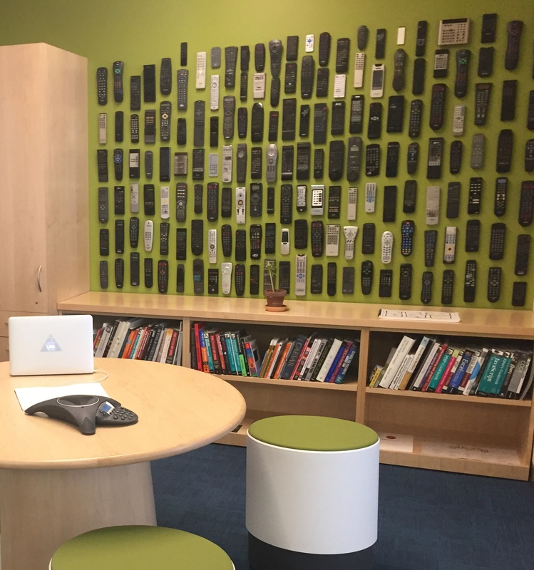
Is there a common product more disliked than the TV remote? With so many manufacturers over so many decades, you’d think a best design would have emerged by now. It hasn’t, and the reason reveals a deep confusion about what “good” physical interaction actually is — three very different kinds of simplicity: engineering simplicity, conceptual simplicity, and aesthetic simplicity. Getting them mixed up, especially the last one, is how a company as design-savvy as Apple shipped a remote its own customers couldn’t hold the right way up.
Engineering Simplicity: A Light Bulb
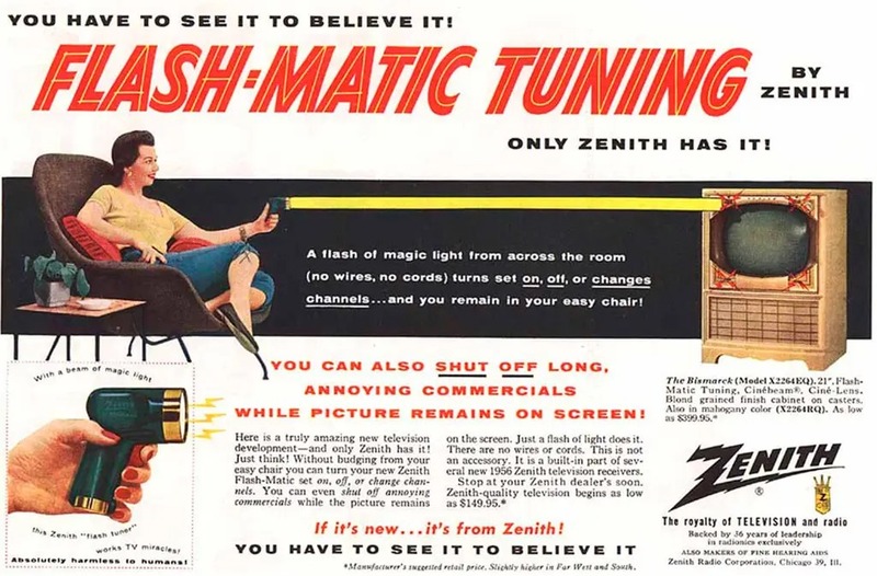
The remote control was designed from the start around engineering convenience, not users. Early remotes had a reasonable hierarchy — channel up, channel down, mute — because the hardware forced the choice. Zenith marketed their Flash-Matic as “absolutely harmless to humans.” Clearly, sedentary obesity was less scary than ray guns.
As TVs added features, engineers added buttons — one per function, never removing anything. Over thirty years this produced the canonical remote: dozens of buttons, no hierarchy, designed for the people who wired the circuit board rather than the people watching TV in the dark. Nobody chose these remotes; they came in the box. Manufacturers treated them as a cost center, not a design opportunity.
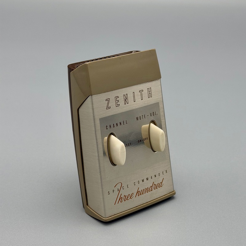
Zenith’s Space Commander worked by mechanically striking a tuning fork — earning it the nickname the clicker.
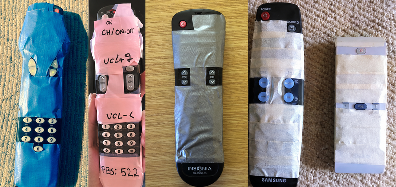
When a remote gets bad enough, users design their own fix — tape over the buttons they never touch, leaving only the ones they need.
Conceptual Simplicity: The Original Apple TV Remote
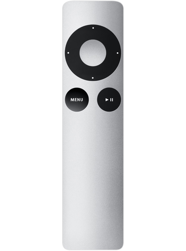
The first-generation Apple TV remote broke from this pattern entirely. Instead of mapping every function to a physical button, Apple moved complexity onto the screen. The remote had almost nothing on it: a directional pad, a select button, a menu button.
The key insight was mental model clarity. The remote had no local state — it wasn’t a controller with modes, it was a pointer for navigating an on-screen menu. You always knew what you were doing and what any button would do.
It was beautiful, too. Apple invested in a silver aluminum body, easy to spot in a dark room and delightful to hold. On my wall of remotes, it stood out immediately.
Aesthetic Simplicity: Where Apple Lost the Thread
When Apple launched the Siri Remote, it looked like a design triumph. Fewer buttons. Clean surfaces. Powerful internals — a trackpad, accelerometer, voice control, game controller capability.
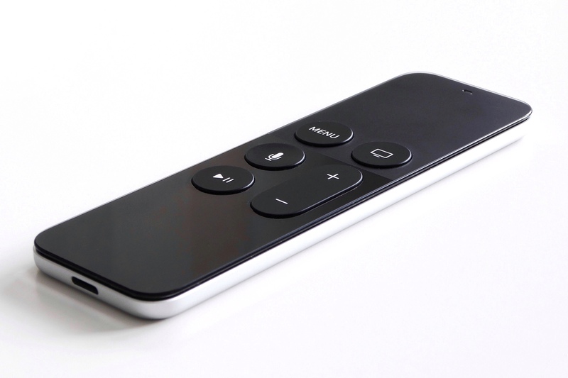
It turned out to be harder to use than the remote it replaced. Owners made the same complaint, over and over: people routinely picked it up and clicked on the wrong end. Reviewers said they did it at least once a night. It’s easy to see why — the flat trackpad looks identical to the flat handle. Everything is aligned, symmetrical, and black on black.
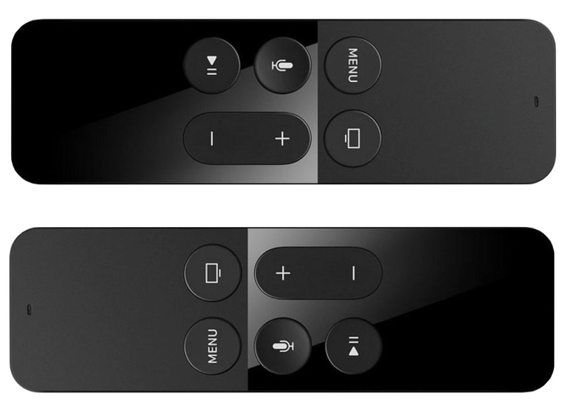
There was no power button; power required a long press of a different button, with no visible affordance. The Play/Pause button also deleted apps — a hidden function with no label, no logic, no discoverability. This is aesthetic simplicity: the pursuit of visual cleanliness at the expense of physical usability.

Why This Happened
On an iPhone, minimizing physical affordances works because the screen carries the interface. The physical shell is a frame for the display.
A remote is the opposite. The physical object is the interface. Shape, texture, button placement, color, weight distribution — every affordance has to communicate meaning through your hand, often without looking.
When all that functionality gets compacted into a uniform black slab in the name of visual cleanliness, nothing has been simplified. The complexity just moves into the user’s head, invisibly, where it surfaces as frustration every night on the couch. Hiding complexity is not the same as solving it.
The Fix Proved the Point
I wrote a much longer version of this story back in 2017, when the Siri Remote was brand new and its flaws were fresh: 3 Kinds of Simplicity, originally published at UXmatters. It took Apple nine years to agree.
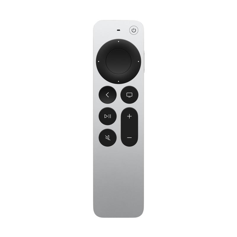
After years of complaints, Apple redesigned the remote. No new technology was required. The new version has a physical click ring around the trackpad — so you can feel the difference between trackpad and handle — plus a dedicated power button and a silver finish. Every major change restores a physical affordance that had been removed in the name of aesthetic simplicity.
The Siri Remote was optimized for one sense: sight. But physical objects speak to all of them. The click of a button is information. The weight of a tool communicates quality. A surface texture tells your hand where to press before your eyes confirm it.
That’s the whole premise of my forthcoming book, Designing the Tangible Interface: design that takes the full range of human senses seriously, not just visual design applied to physical objects. Each sense turns out to have its own rules, its own opportunities, and its own ways of going wrong.
Next week - prototyping with infrared remote technology!