A Tangible Talk with Mitch Heinrich of Copper
Interview conducted May 8, 2026
“If you never need to read the manual, I feel like we’ve succeeded at the highest level.”
For my forthcoming book, Designing the Tangible Interface, Mitch Heinrich of Copper was kind enough to talk about designing Charlie, Copper’s battery-equipped induction range: why its knobs point, why the wooden ones weigh more than wood should, and how an LED bar graph stands in for a flame.
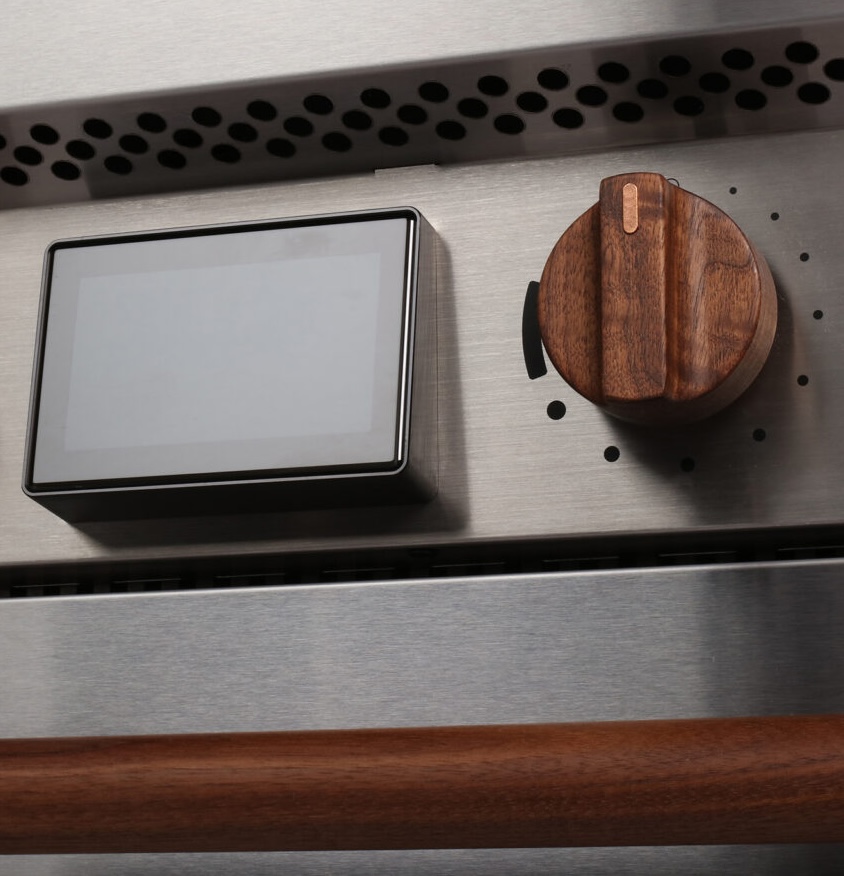 Image: Copper
I was delighted to find the Copper stove after learning about induction cooking via a series of AirBnBs in Europe. Induction is fantastic. The glass-top touch controls are miserable. Copper put knobs on theirs, including wooden ones. I thought: this might be the kind of design that makes induction take off in the US.
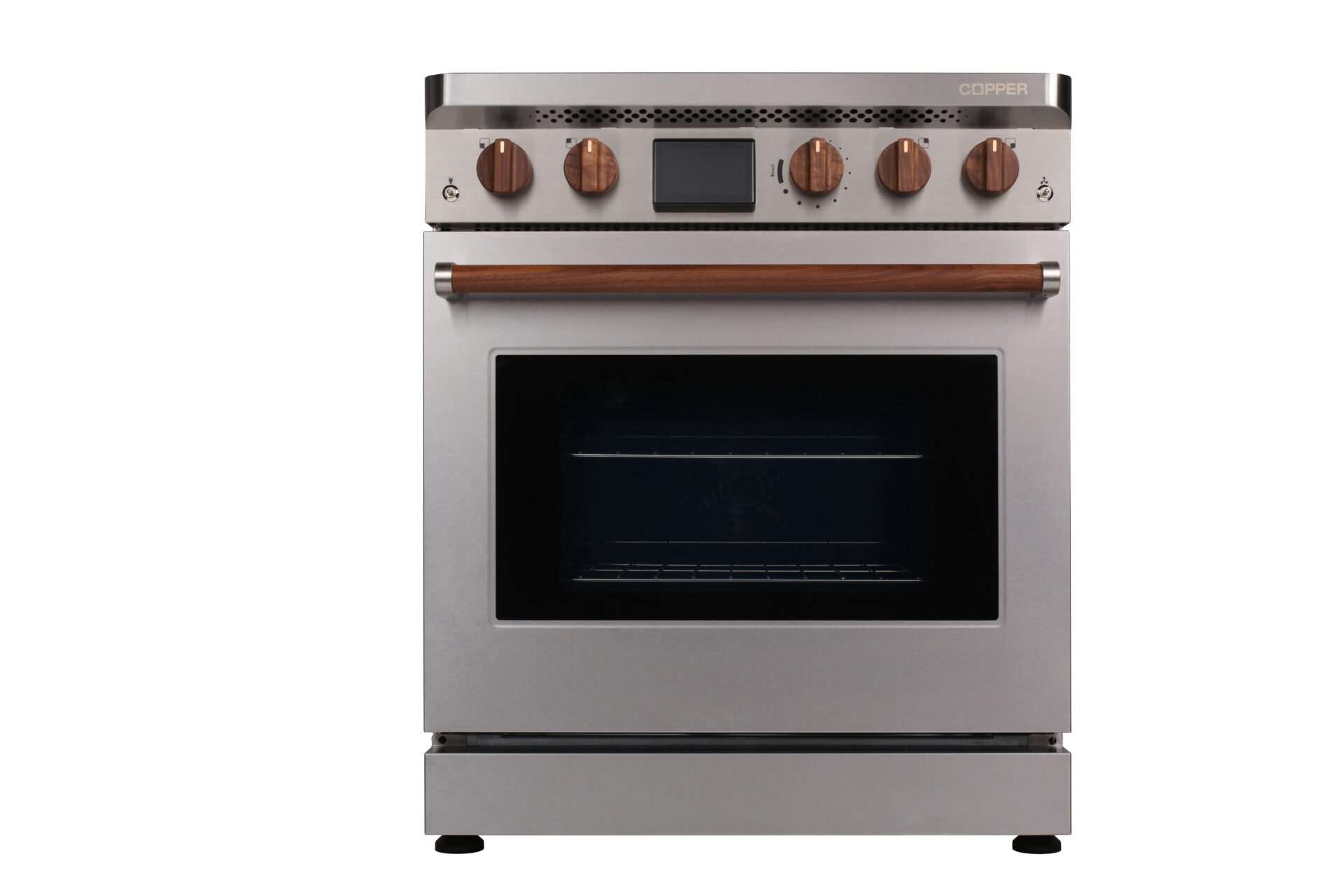 Charlie, Copper’s induction range. It charges its internal battery when electricity is cheapest and cleanest, then cooks from the battery during peak hours. Image: Copper, via Autodesk
Mitch Heinrich is Vice President of Product at Copper, where he is responsible for the brand, UI, UX and physical design of the company’s induction range. He studied industrial design at San Francisco State University and has spent his career on emerging technology: airborne wind turbines at Makani Power, human-powered generators for off-grid Sub-Saharan Africa, founding the Design Kitchen prototyping group at Google X, and leading product R&D for biomaterials at Bolt Threads.
How did you get into design?
My dad was a woodshop teacher for 30 years, and my childhood summers and weekends often included helping with his side hustle renovating kitchens and bathrooms: knocking out cabinetry, building new cabinets, a lot of sanding and staining, installation. That was my early understanding of the material world, and of the idea that the world can be changed. You don’t have to accept it as it is.
I didn’t know industrial design existed until the end of sophomore year in college. I’d taken art classes and some engineering coursework, but wasn’t deep enough into math, and I was looking at graphic design. Then I found industrial design and said, this is the thing.
At San Francisco State in the early 2000s, the program was so impacted that to graduate on time I had to take whatever design classes I could get: print, web design, design communication. At the time I was frustrated, because they felt adjacent to what I wanted. Twenty-plus years later, those are the skills I use every day. I lead the brand, the UI, the UX, the physical design, and I know enough about each discipline to lead them as a system.
You’ve spent your career on things that didn’t exist yet.
Almost all of it. Makani Power made big tethered airplanes that flew in circles at high altitude and generated electricity. I worked on human-powered generators so people off the grid in Sub-Saharan Africa could charge a phone. Those projects needed form development and figuring out the nugget of usefulness to people, then forming an object around it.
At Google X, I started the Design Kitchen. Brilliant computer scientists and physicists all needed help envisioning and building their version zero: how does it work, how can we test drive the idea without building the whole thing? I had the opportunity to build a team with wildly diverse skills, who would never otherwise have been hired at Google, in a place where we didn’t know what we’d build next week, much less next month. I stacked the team with scrappy self-taught electronics hackers, mechanical engineers specializing in optics, sculptors and model makers, 3D printing and CNC experts. Everything you need to build a high-fidelity prototype fast. We worked on wireless communications in the stratosphere and on heads-up displays, face computers like Google Glass.
After that I specialized in biomaterials. I looked at what’s in the landfill, and as it turns out textiles make up an insanely large percentage of what we throw away. Bolt Threads had a transgenic yeast you brew like beer, but instead of producing alcohol it makes spider silk protein, which can be spun into fiber and textiles with programmable performance, and then composted at the end of life. I led product R&D at Bolt. My team would literally get buckets of new-to-the-world goop, and our job was to understand their unique properties and translate them into charismatic objects that the world would see value in.
How did Copper start?
It came out of a Department of Energy grant to Otherlab, the San Francisco climate tech incubator started by Saul Griffith, whom I’ve known for 20 years. To electrify, we need to add a lot of storage to the grid quickly. You can do that centrally, with giant battery installations that soak up midday solar and release it in the evening when everyone comes home and turns on the AC and cooks. But that approach requires building a lot of infrastructure, not just in the energy storage systems but in all of the high-voltage transmission lines to deliver that power, not to mention upgrading the buildings that will use that energy but are currently set up to burn fossil fuels.
The funded pitch was: what if the storage went directly into the devices that use the most power? An appliance with a battery on board costs about what the battery cells cost. There are no construction project costs on top. No building inspections, no electrical panel upgrades. You just plug it in. Compare that to a home battery: the installed cost per kilowatt-hour is easily ten times the cells, because of engineering drawings, permits, electricians, inspections and project management costs.
It also makes switching easy. You don’t have to disrupt your life by getting quotes from electricians and then comparing multiple bids against each other and against what you think rewiring a kitchen should cost. Our range plugs into the same 120-volt outlet that already powers the pilot light and clock on your gas range. It takes under an hour to get the old gas range out and a Copper range in.
I’ve known the founders for a long time. When they were getting this idea off the ground, they asked me to consult on the project as a designer-in-residence at Otherlab. It quickly became the most fun thing I was working on. I felt a little selfish when I decided to join full time, because compared with biomaterials it’s an easier problem, more purely in the design world. The components exist; we were just assembling them in a novel way, so it was truly a design challenge, not a physics or material science challenge. It meant I could focus my efforts more squarely on the experience than I was used to.
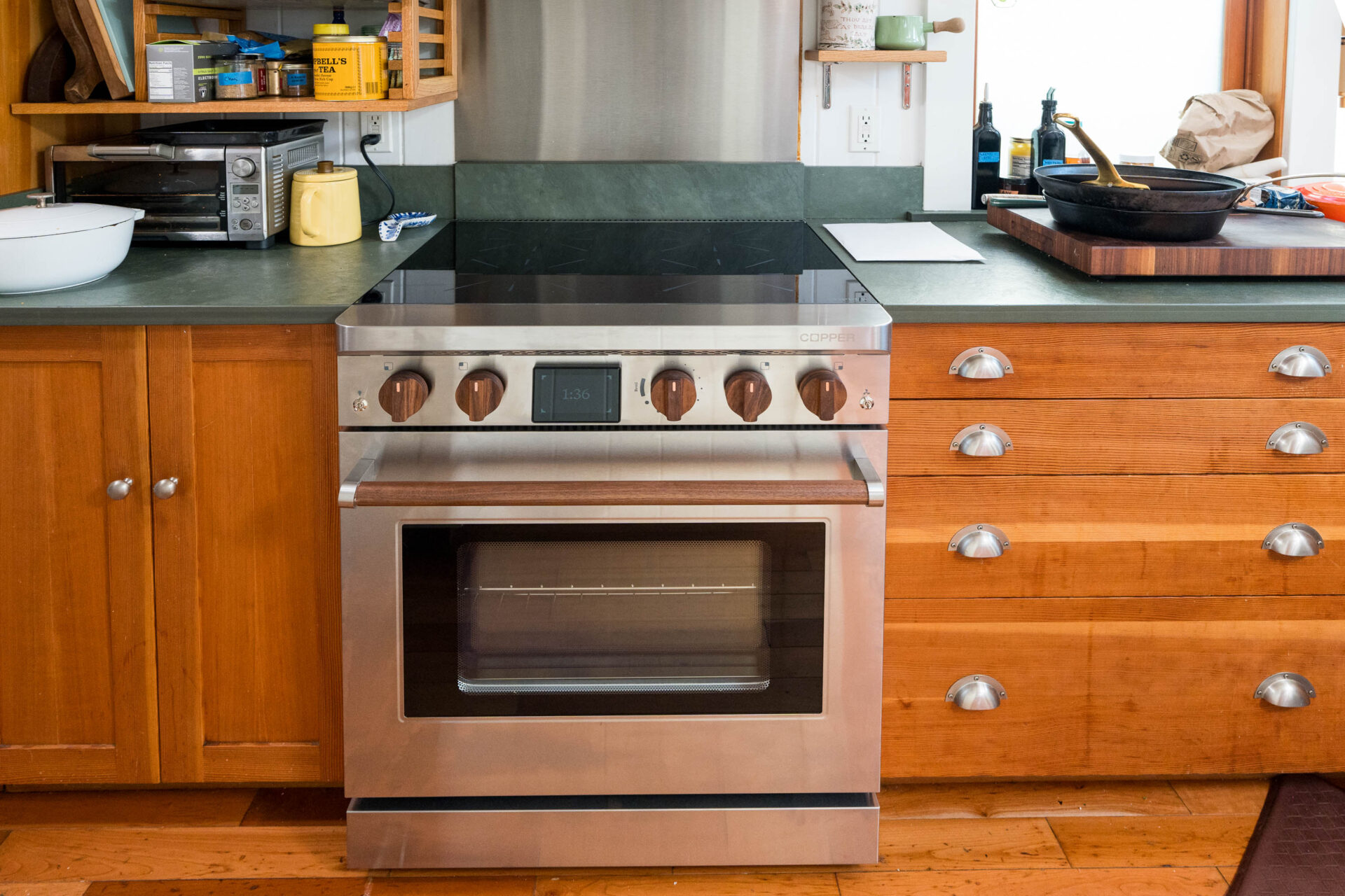 Charlie in a kitchen. On battery alone it can cook three to five meals during a power outage. Image: Copper, via Autodesk
What did you want it to feel like?
A life upgrade. Not a sacrifice in service of making a more sustainable choice. In a crowded and competitive market, I didn’t want to race competitors on paper specs, this many kilowatts, that much coil area. I knew intuitively that those specs don’t translate into better products. The thing with the most modes or the biggest numbers isn’t always the thing you reach for. You reach for the thing that has the least amount of friction to use, works reliably and, if you are lucky, has something about it that brings you joy.
I think a lot about truth in materials, and about matching materials with their most appropriate use. Your toothbrush will probably last 100 years in the landfill after the three months you use it. I want objects that can be reclaimed, or disappear in a better way. I also want to expand the palette of consumer products; I’m tired of plastics.
And then there’s emotional durability. Charlie is a technology-enabled product to be sure, but the technology isn’t the point. The point is hot food, achieving the right textures, wonderful smells, easy cleaning and ultimately bringing people together. A lot of appliance competitors name products with a 16-digit SKU. Zero personality, barely human readable, and it’s implicitly going to be replaced by the next model number. That’s more aligned with tech gadgets with a short life expectancy, not with an appliance that should last a decade or longer. That’s why we named it Charlie.
Why tangible controls?
People discount that we’ve evolved over millennia to have fine proprioception, and it’s completely lost on a flat plane of glass. There’s no tactile feedback, no confirmation of intent. It’s not really a touchscreen; it’s a look-and-touch screen, because you can’t operate it without your eyes. People told us induction cooking was interesting but they hated the interfaces. They prefer things like the volume knob on an amplifier. Tactile feedback is more intuitive and more pleasurable, and it’s a big differentiator for us, frankly, because nobody else in our space appears to think about it with the same level of importance.
One of my favorite things is reading the Reddit comments from people who have bought a Charlie. Occasionally they will say it’s awesome because it doesn’t do a lot. As a designer you might think, man, I wish they were talking about all our amazing features. But I find a lot of fulfillment in people celebrating its simplicity and the lack of feature creep. It’s a tool that gives you everything you need to achieve your goals without making you remember the difference between Turbo and Chicken Bake mode. If you never need to read the manual, I feel like we’ve succeeded at the highest level.
I picture Grandma over for dinner, wanting to help cook. Is she going to pilot the Starship? Push this to unlock, then increment up or down? What does a number 6 mean? Is that a lot or a little? No. If she walks up and it has the same controls she’s used on her gas stove for 50 years, game on.
Michael DiTullo’s sketches in the Autodesk article about Copper show all kinds of knob shapes, including some crazy starfish. How did you land on these?
We iterated a lot. We wanted two versions with some distance between them. The standard knob is polymer, and it’s meant to look at home on the range, a little top-heavy, like a waterfall, with radii your fingers fit into. Classic industrial design ergonomics. Some designs we tried were radially symmetric, and they lacked a clear way to tell from across the room whether a burner is on or off. So there’s a clear indicator: the cook zone is on, maybe halfway, maybe all the way, and you know it at a glance.
The wood version encourages a pinch grip and maximizes how much of your fingers touch it, because it’s a beautiful, warm material. It’s a luxury upgrade, so you want a good, solid connection that’s warm instead of cold, and visibly weightier.
The woodworker and CNC machinist in me also says: align the grain along the pinch grip, so you’re not touching end grain. We work with domestic manufacturers to source reclaimed wood whenever possible and machine it here, finished with a zero-VOC durable hard wax oil, so it feels like wood and not like plastic that looks like wood. I asked vendors in southern China about black walnut knobs, and they said sure, but black walnut doesn’t grow there, so the material does a lap around the world, and there’s pressure to make it as cheaply as possible. Friends at other companies with wood parts have told me about supply chain transparency problems. I’ve had a vendor send an FSC certificate with another company’s name on it. I didn’t want any of that in the conversation.
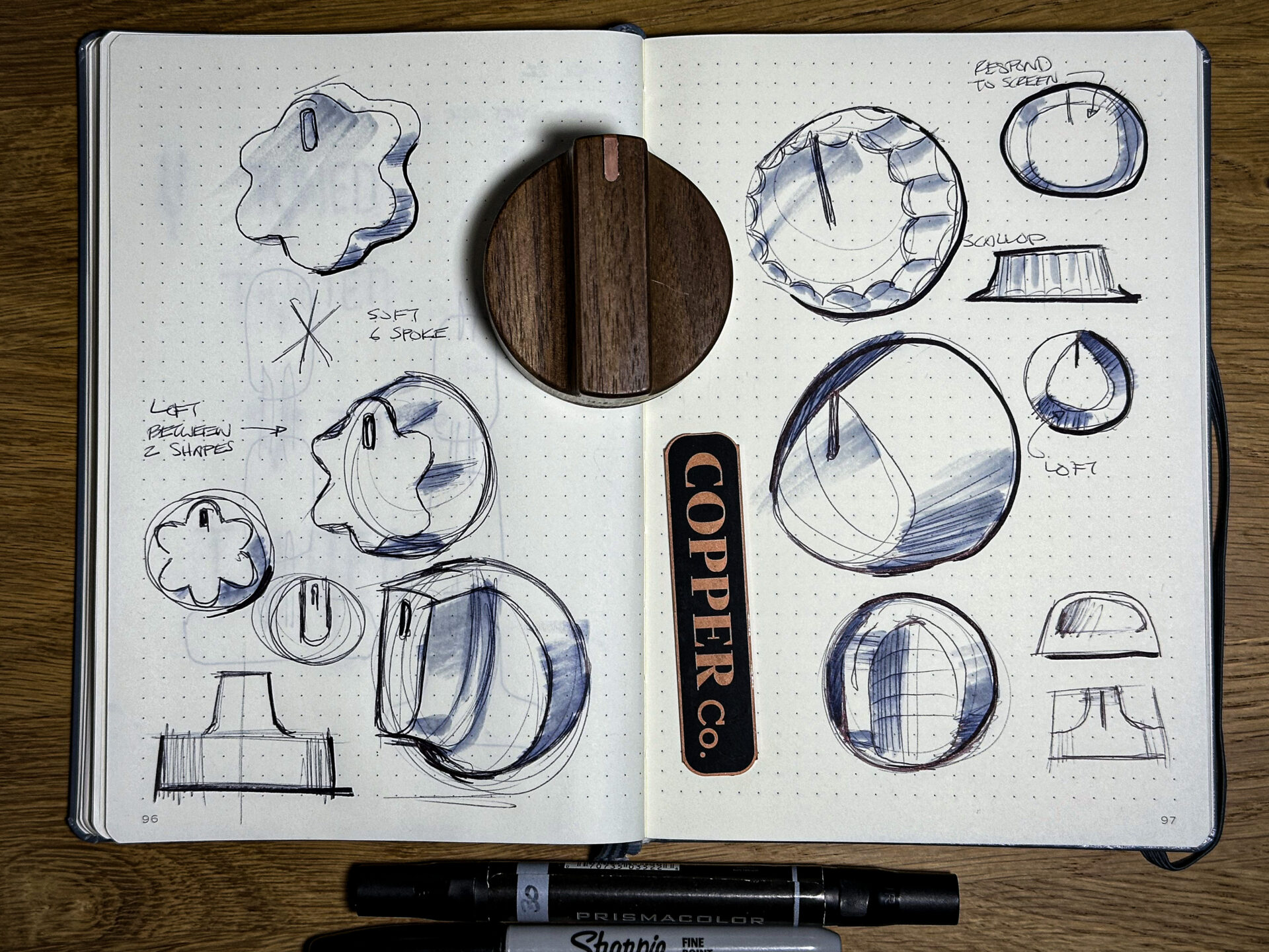 Knob concepts by industrial designer Michael DiTullo, who worked with Mitch on the knobs, the brow plate across the front of the range and the oven handle brackets. DiTullo says he would send 20 new ideas in a couple of days, and Mitch would add four more to the same file. Sketches: Michael DiTullo. Photo: Copper
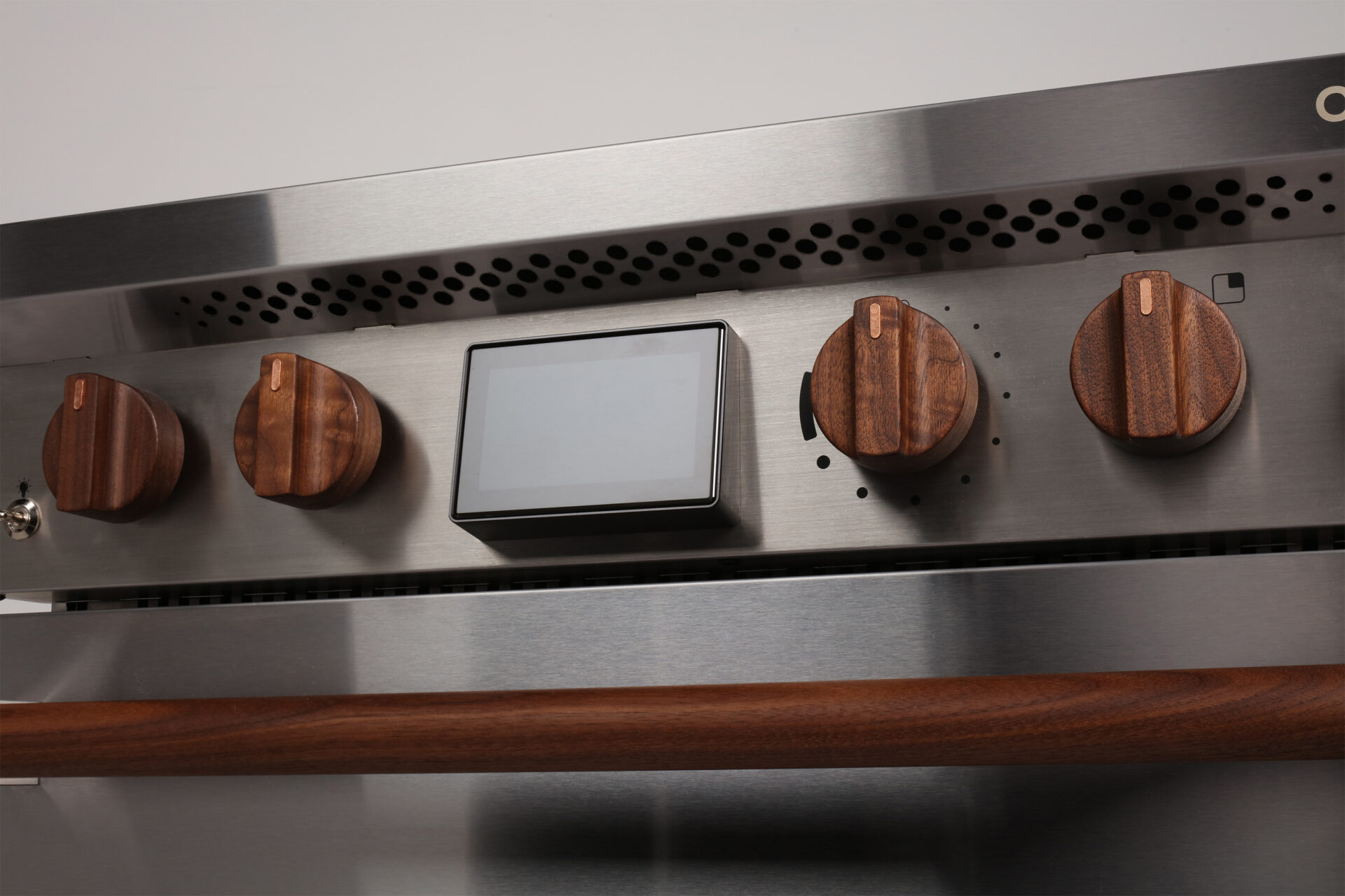 The original batch of wooden knobs was black walnut reclaimed from a barn in Sonoma, California. Image: Copper
Did you prototype before machining the first batch yourself?
Physical prototyping is a huge part of my process. Because of my consulting business, my workshop is well equipped: a big CNC router, many 3D printers, laser cutting, a full casting bench, etc. I’m too impatient to send a design out and wait for someone else to make it. That iteration cycle is too slow for me, and I learn less from doing that.
For the knobs I sketched a little to clarify the underlying goal in my own head. Then some quick CAD for some very different designs that I can get onto the printer. The main goal was to learn: how do these shapes feel? Oh, I didn’t realize it would feel so slippery, or that radius is so big there’s nothing to grab onto. Once I have conviction about a style, I create toolpaths and machine it.
Toolpathing is its own art, and it gives you a sense of what the thing will cost. If there are lots of tool changes and operations on different faces, my inherent laziness as a machinist makes me eliminate them to get the part faster. Can I pare it back more? How do I make the intent shine through with the least amount of work? The knob’s two sloping top surfaces, without complex surfacing, mean we can cut the top in two passes with a custom-shaped router bit, instead of buzzing away with a ball-end mill for a long time. Fewer tool changes, less machining time.
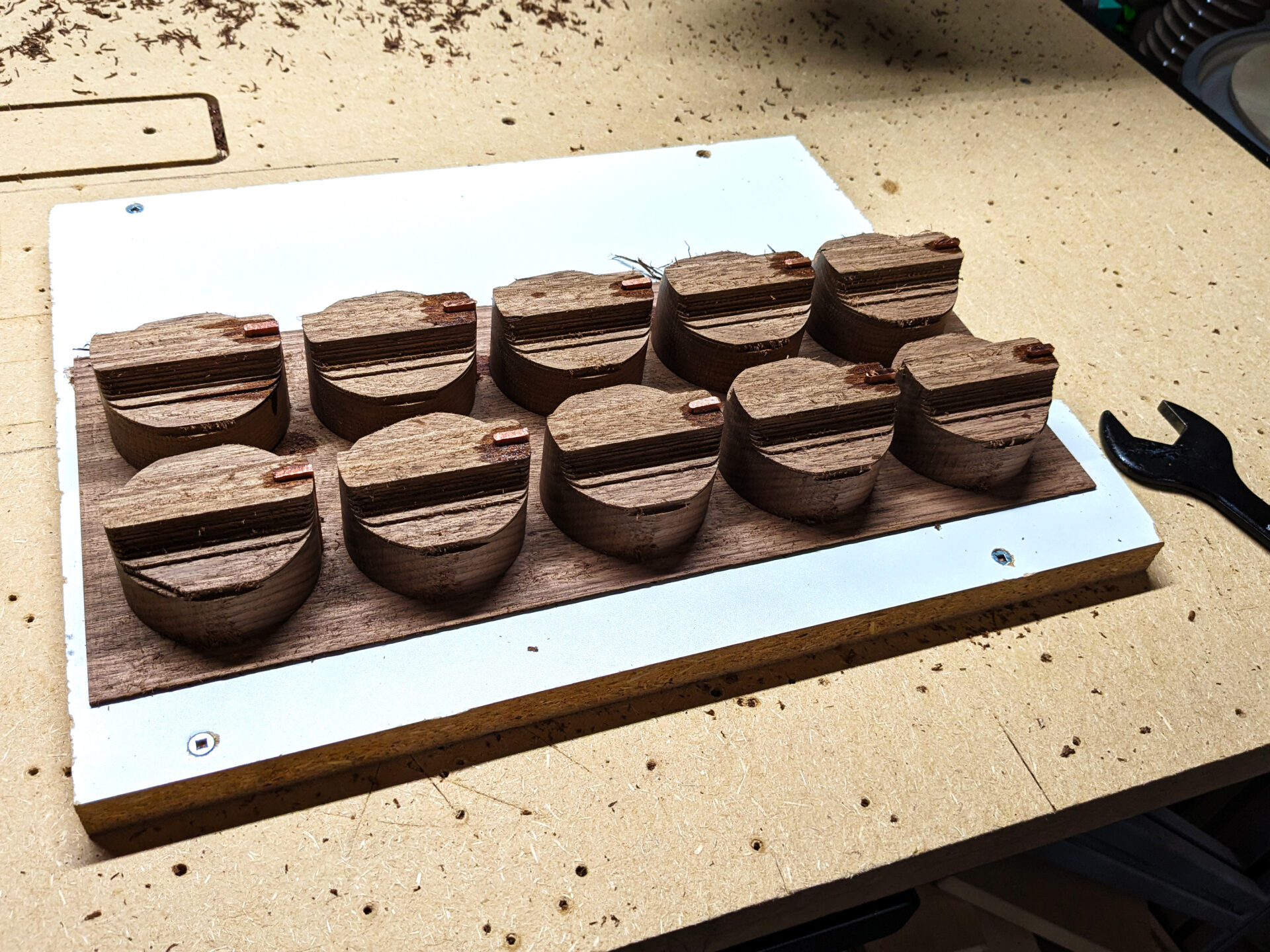 Mitch machined the first 150 wooden knobs himself, after most CNC shops wouldn’t take on the job. A manufacturing partner makes them now. Image: Copper, via Autodesk
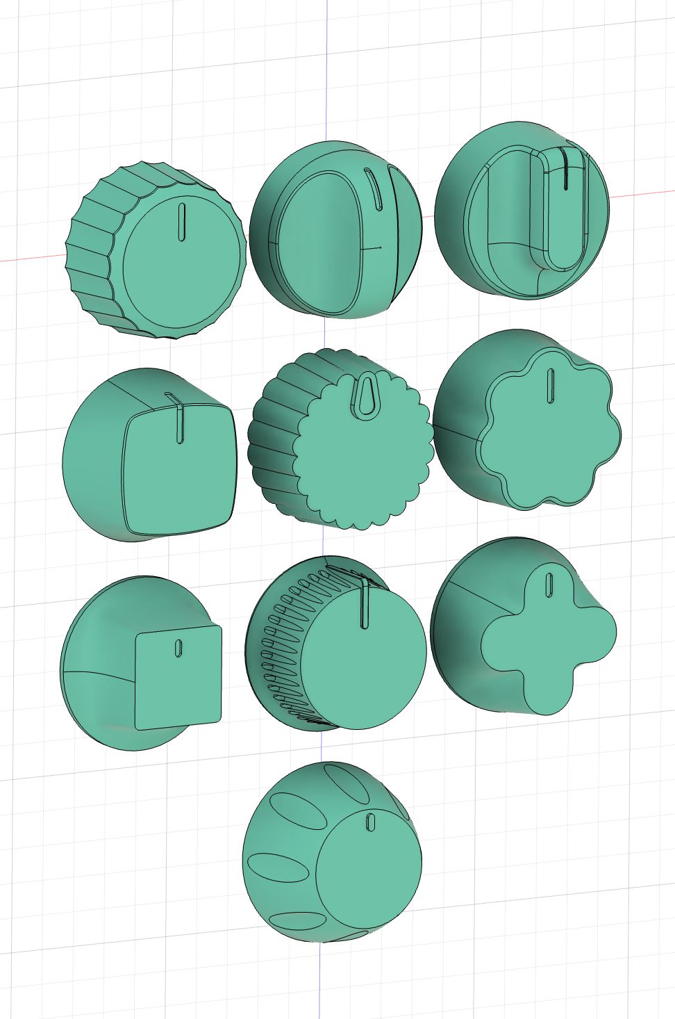 The knobs modeled in Autodesk Fusion, which Mitch uses for both the CAD and the toolpaths. Image: Copper, via Autodesk
Anything else about the knobs?
I’m working on a new version that looks the same from the front but optimizes for better tactility. The opportunity I see for improvement is in its weight. Weight matters, especially in Western culture, where weight is often tied to reliability and quality. There’s value in a little flywheel damping when you turn it, but there’s also the unboxing experience. The knobs often arrive before the range in their own packaging. This drastically simplifies inventory on our end, but importantly gives the customer a little additional ownership of the product when they put a few minutes of work into installing the knobs. When you pull these little pieces of wood out of their package, they should feel like the price is justified, and wood alone doesn’t weigh very much. So this new design has a very nice stainless disc mounted in a counterbore in the back, with a crisp branded laser etch.
Your website shows people assembling the range themselves, even setting screws.
It reinforces that this isn’t this year’s model, a tech product that gets outdated and recycled. I believe if you invest a little effort in an object, it endears itself to you in a way that something that was solely purchased doesn’t. Those small tokens of effort make it yours.
How do the knobs work? Can they come off for cleaning?
Yes. On the dash plate of Charlie are five potentiometers with D-shaped shafts. The knob has a friction fit with a small leaf spring, so you just push it on firmly.
The bar graph
Since you’re a tangible interfaces guy, let me show you something on Charlie that’s not particularly clear on the website yet. This is our kitchen and our workshop.
Turn the knob, and a small display shows a precise percentage if you want it. My wife knows that at 30%, she can put her oatmeal on, take a shower, and come back to a perfectly cooked pot. Charlie has 20 power levels and a boost mode. If you turn the knob to 100% there’s a detent, and if you turn past that, the cook zone will go into a boost mode for about five minutes, for boiling big pots of water.
Most people don’t want to be glancing down at a screen while cooking, and people are used to judging heat by flame height. So each cook zone has an LED bar graph that rises as you turn up the heat. Then the fun question: what does boost look like, when you’re already at 100%? The answer is a bubbling animation, little bubbles going up.
I prototyped that interaction with an Arduino and an LED strip, trying every animation I could think of to communicate “boost.” To be honest, even the bar graph wasn’t obvious at first. Also, the iteration cycle could have been long and painful. I didn’t want to have a UX idea, try to creative-direct a firmware engineer who has more pressing things to do, and ultimately be unhappy with the result.
The breakthrough for me was adopting AI. This was in the days following the launch of ChatGPT. While I could have prototyped the code by hand, it would have taken weeks of banging my head against different ways to make the math work for a bunch of different animations. Instead, I described the animation to the AI in designer terms: what if it’s like Knight Rider? A comet? It became a rapid iteration partner: keep that frame rate, but change the tail length. You describe the result without needing to know the underlying math, and iterate insanely fast. It took a week to do what would otherwise have taken months to define code and polish. After that week, I gave the firmware engineers my Arduino code describing the math, and they mapped it to our codebase and clock cycles with a huge head start, and the result on the product looks just like my prototype.
The Japanese woodworker Toshio Odate talked about the “user’s finish”: what a wooden tool looks like after it’s been used 10,000 times.
I love that. There are many like it, but this one is mine. Things wear in instead of wearing out: the leather belt that gets more supple, the baseball mitt that fits your hand. You won’t get that with a plastic-coated finish. With a natural finish, it wears in, with marks and discoloration, more like a cutting board.
Anything else on your mind?
Design is an editing process: what you explicitly don’t do. The lazy designer defers every choice to the user: menus and modes, chicken roast mode, double convection bake mode. That adds cognitive load, and I think it’s a huge disservice. There’s dissonance, because more features look great on a spec sheet, and the business always pushes for more, with a little trademark after each feature. But the user experience is poor. I think above all else people want a product that does what’s promised, in a way they don’t have to think about.
An example of this is our oven. Most ovens run on AC power with a relay that’s on or off, cycling over seconds and with a long feedback loop that is governed by a mechanical switch like an old thermostat. So the temperature overshoots and undershoots the set point, often as much as 25 or 30 degrees each way. Set 350, and you’re swinging between 325 and 375. When you put the food in during that cycle changes how much heat it gets, from one batch of cookies to the next. Ours runs on DC from the battery, which lets us use PWM and PID control loops. We released a firmware update that made the oven 10 times more precise, within 2 or 3 degrees. The convection fan is on a DC brushless motor too, so in normal bake it spins slowly to mix the air, and rack position matters less. The net result is not a new mode or a new feature on a spec sheet, but an oven that bakers love because it’s consistent and precise.
Most induction cooktops I found in a New York showroom had the exact same plus-and-minus touch controls.
Once you know the underlying components from the Tier 1 suppliers, you recognize the layouts, and it’s all more or less the same. The legacy controls are optimized to the point of being borderline unusable: the lowest-cost interface, some seven-segment LEDs and capacitive touch buttons that cost single-digit dollars all-in. There are so many better ways to do it.
Car companies are putting buttons back after touchscreen backlash.
The Wall Street Journal ran an article, “Touch Screens Are Over. Even Apple Is Bringing Back Buttons,” about exactly that: car companies getting so much pushback on touchscreens that they’re putting buttons back in dashboards and steering wheels, and a new crop of companies focusing on tangible controls. They saw our range, and as a startup, we were mentioned in the same breath as Apple. What a dream.
“Now that touch screens are the cheapest option, they’re being deployed everywhere, even in places where they don’t belong.”
—Sam Calisch, CEO of Copper, in the Wall Street Journal
We have a Tesla, and the touchscreen is one of our biggest frustrations. In Oakland the streets are really bumpy, so you can’t touch the screen with any accuracy until you reach a smooth stretch or come to a stop. It’s infuriating for my 10-year-old when she’s trying to play her favorite song on the short drive to school.
Airplane cockpits have an “index”: a place to rest your hand before reaching for a control, so you can find it without looking.
Like the little bumps on the F and J keys. I hadn’t appreciated that. It’s the ground truth for your proprioception, so you know how far to reach for everything else.